User guide - Storage Standalone Configurator
This section provides information on how to launch and begin 3D planning with HomeByMe for Storage standalone configurator along with the information about the icons used in the application.
Launch the Storage Standalone Configurator
Storage Configurator has a standalone mode in order to launch it directly in client's website. There is no link and dependency with any planner.
To access to this configurator, you can click on your dedicated entry point on your website and launch the Storage Configurator. For more details about the integration of the configurator in your website, visit the Setup documentation 🔗
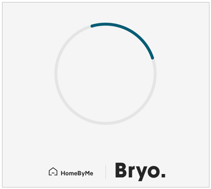
While opening the Storage Configurator, the loader appears with the brand logo before loading the configurator, as shown below:
The color of the spinner changes from black to blue.
For more details about Dynamic Branding, visit the Dynamic Branding documentation 🔗.
When the configurator is completely loaded, you can start the experience.
Icons Used in the Configurator
Before you start the configurator, it is helpful to know how to use HomeByMe for Storage Configurator (standalone) features. Many of the features you use are accessible on the configurator with printed commands on them.
These features are context sensitive, which means that commands are grayed out if the features are not available for your current task. Sometimes, the features do not appear at all, so it is helpful to know where you can access them.
Features that have text command printed on them are not mentioned below.
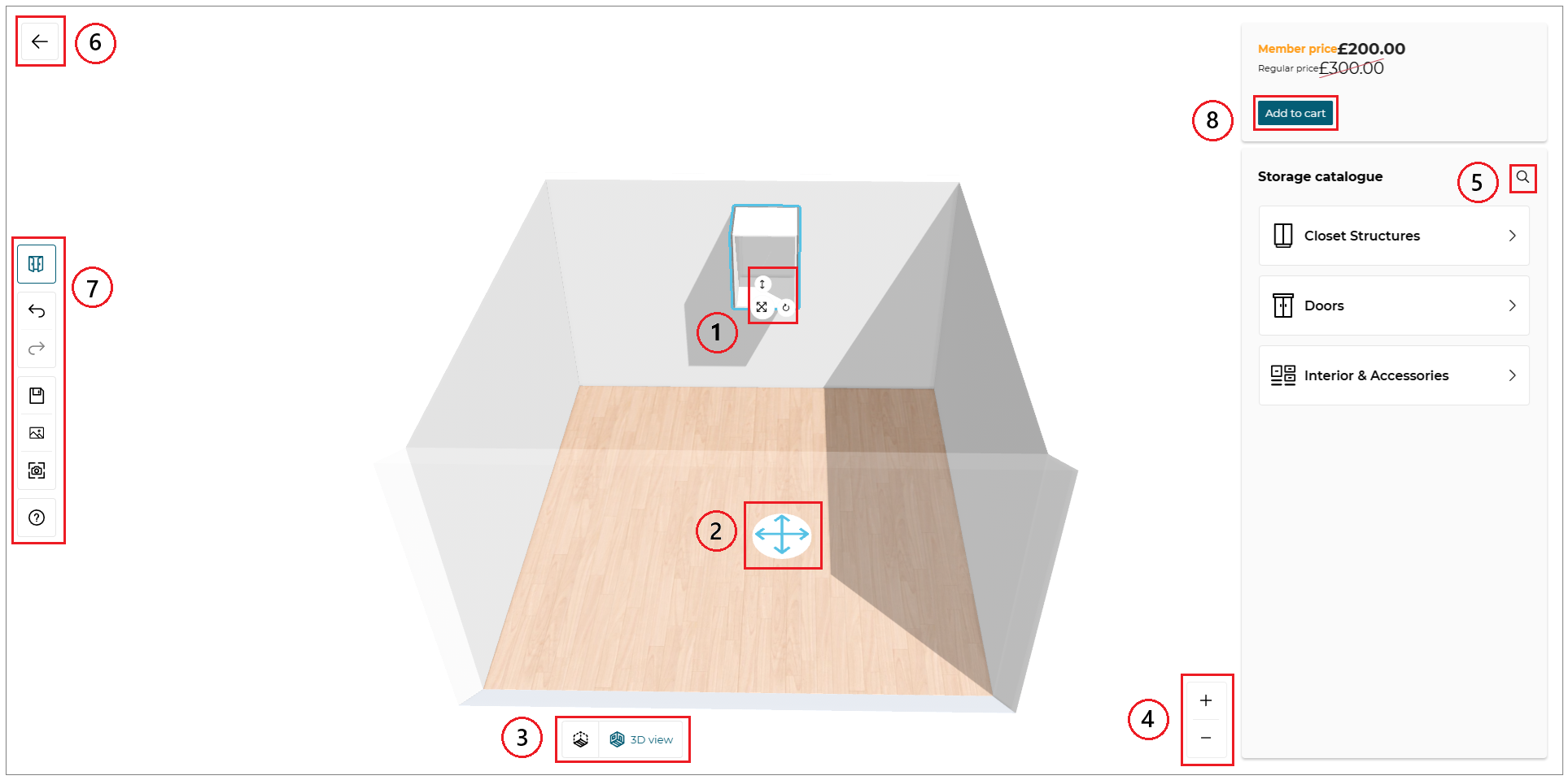
1. Manipulators
| Feature | Icon | Command | Command Location |
|---|---|---|---|
| Move |  | Allows moving the product, sub-product or accessory in all directions | Planner |
| Rotate |  | Allows rotating the product, sub-product or accessory | Planner |
| Elevate |  | Allows elevating the product | Planner |
2. Avatar
| Feature | Icon | Command | Command Location |
|---|---|---|---|
| Avatar |  | Allows moving the avatar in the room | Planner |
3. Navigation Icons
The navigation icons allow you to switch from a 3D view to 2D view.
| Feature | Icon | Command | Command Location |
|---|---|---|---|
| 2D view |  | Activates the 2D view. You can edit your products in this view. | Planner |
| 3D view |  | Activates the 3D view. You can visualize your project in 3D and edit your products. | Planner |
4. View Mode Options
| Feature | Icon | Command | Command Location |
|---|---|---|---|
| Zoom-in |  | Moves you closer | Above view options |
| Zoom-out |  | Moves you away | Above view options |
5. Search
| Feature | Icon | Command | Command Location |
|---|---|---|---|
| Search |  | Search product | On catalog panel |
6. Exit Configurator
| Feature | Icon | Command | Command Location |
|---|---|---|---|
| Exit |  | Exit configurator and go back to client's website | On top bar |
7. Command Bar
| Feature | Icon | Command | Command Location |
|---|---|---|---|
| Undo |  | Cancels the previous action | Command bar |
| Redo |  | Repeats the previous action | Command bar |
| Show/hide fronts |  | Show or hide fronts | Command bar |
| Save |  | Save the configuration | Command bar |
| Show images |  | Displays 2D Plans and screenshots | Command bar |
| Take screenshot |  | Take a screenshot | Command bar |
| Help |  | Need help | Command bar |
8. Add to Cart
| Feature | Icon | Command | Command Location |
|---|---|---|---|
| Add to Cart |  | Add to cart the configuration | On property menu |
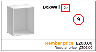
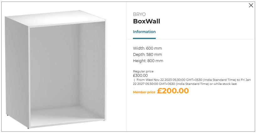
9. Product Information
The Product Information icon is available in the catalog beside each product name as follows:
| Feature | Icon | Command | Command Location |
|---|---|---|---|
| Information |  | Provides product information | Beside product name |
Edit the Default Room
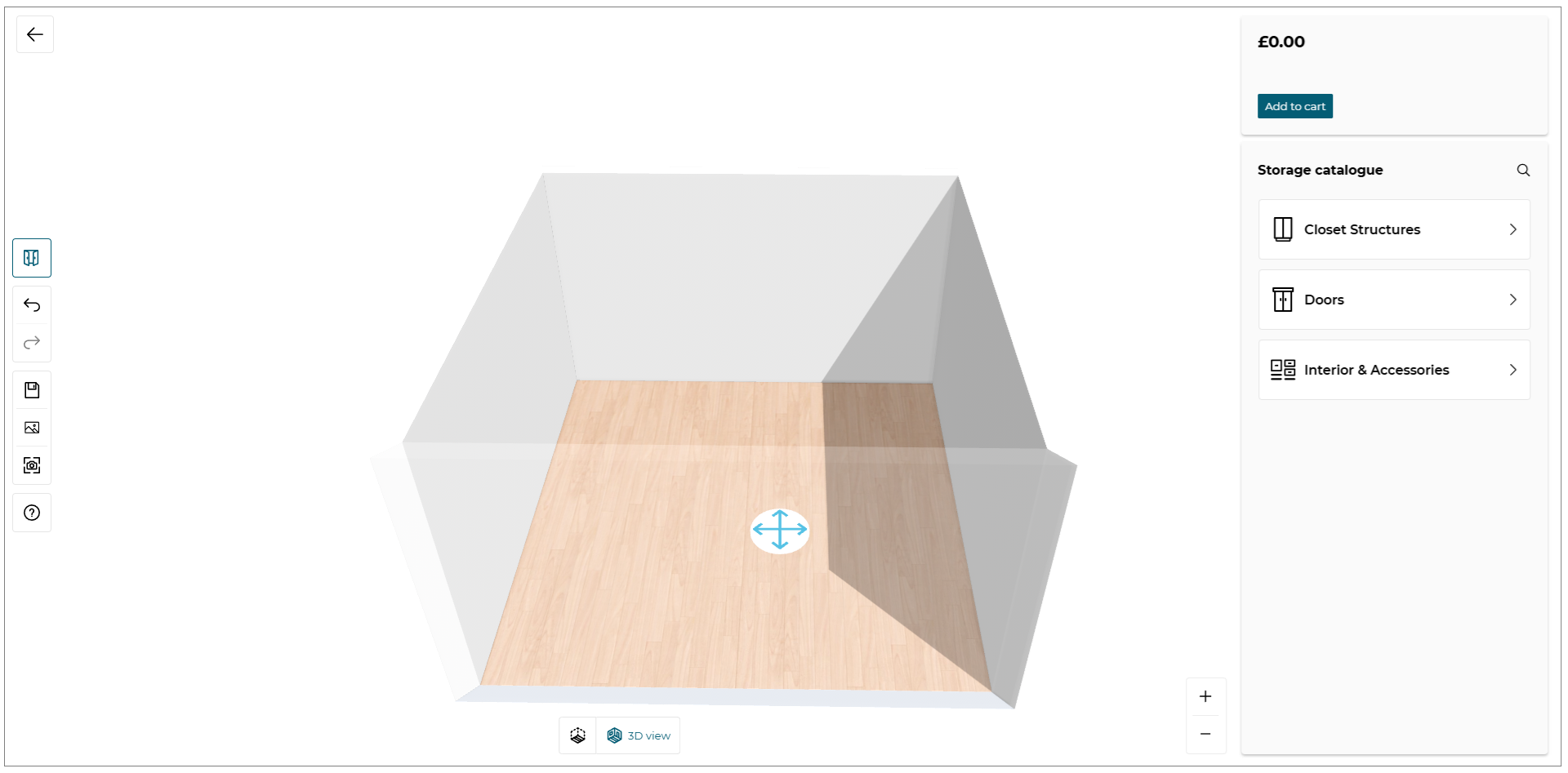
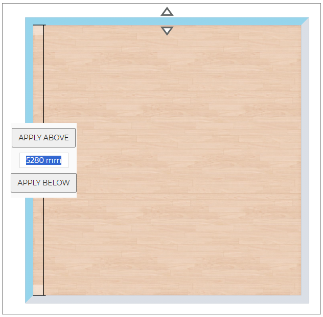
As it is a configuration experience, the configurator provides only one room but you can edit the dimensions of the room in 2D view.
Go to 2D view by clicking on in the navigation panel.
You can now edit the dimensions of the room, resize it smaller or bigger.
Choose Room Shape
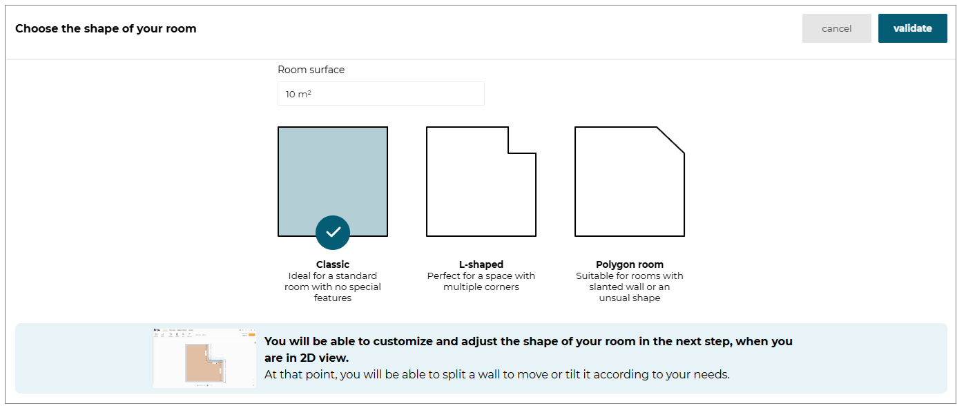
In the Storage Standalone Configurator, you can now choose from a list of pre-defined room shapes to design your storage configuration. This feature enhances your design options by providing various room shapes.
- Select the room in 3D view, the option to change the Room shape is displayed, as shown below:

- Click the Room shape option, the Choose the shape of your room window is displayed, as shown below:
-
Select the desired room shape from the pre-defined room available.
-
Click the Validate button to apply the selected room shape.
Add A Storage Structure
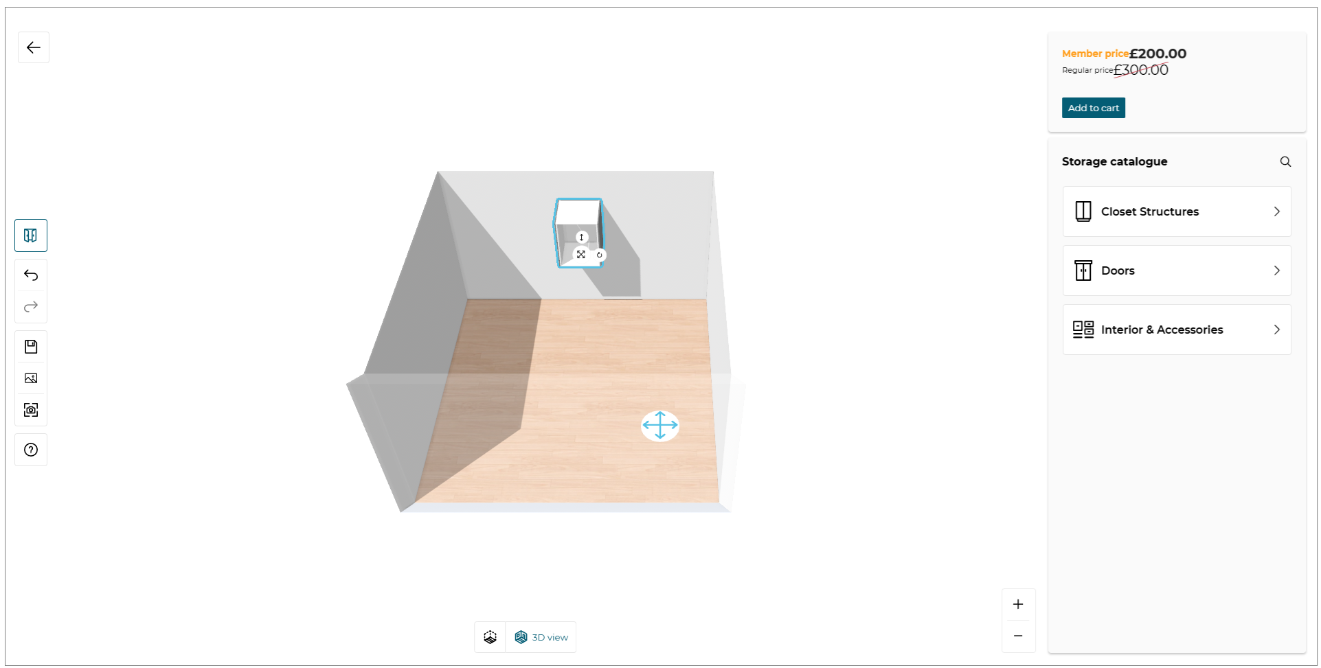
You can add a product through the Storage catalog menu at the top right of the Configurator.
The Storage catalog menu is customizable depending of the different categories you want to display in the menu.
For more details, visit the Application Distribution documentation 🔗.
When you click on one property, a catalog is displayed to browse the different products with the chosen category.
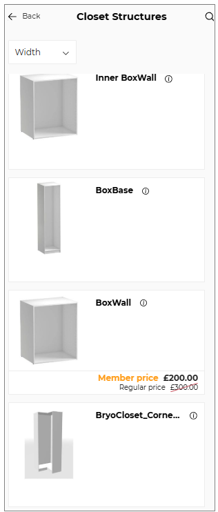
You can add directly a product in the room by draging and droping it from the catalog.
If you would like to choose another category in the Closet Structure, click on Back button to go back to the main menu.
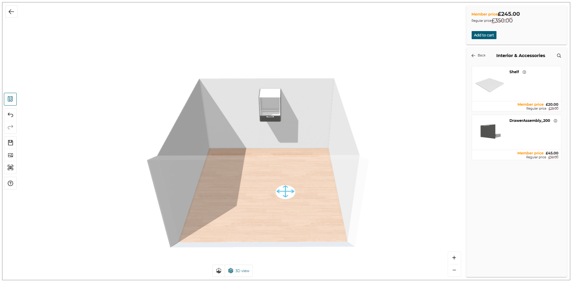
Add A Sub-component And Accessories
After adding a closet structure, you can build the interior of the boxes or add some accessories if the products are compatibles.
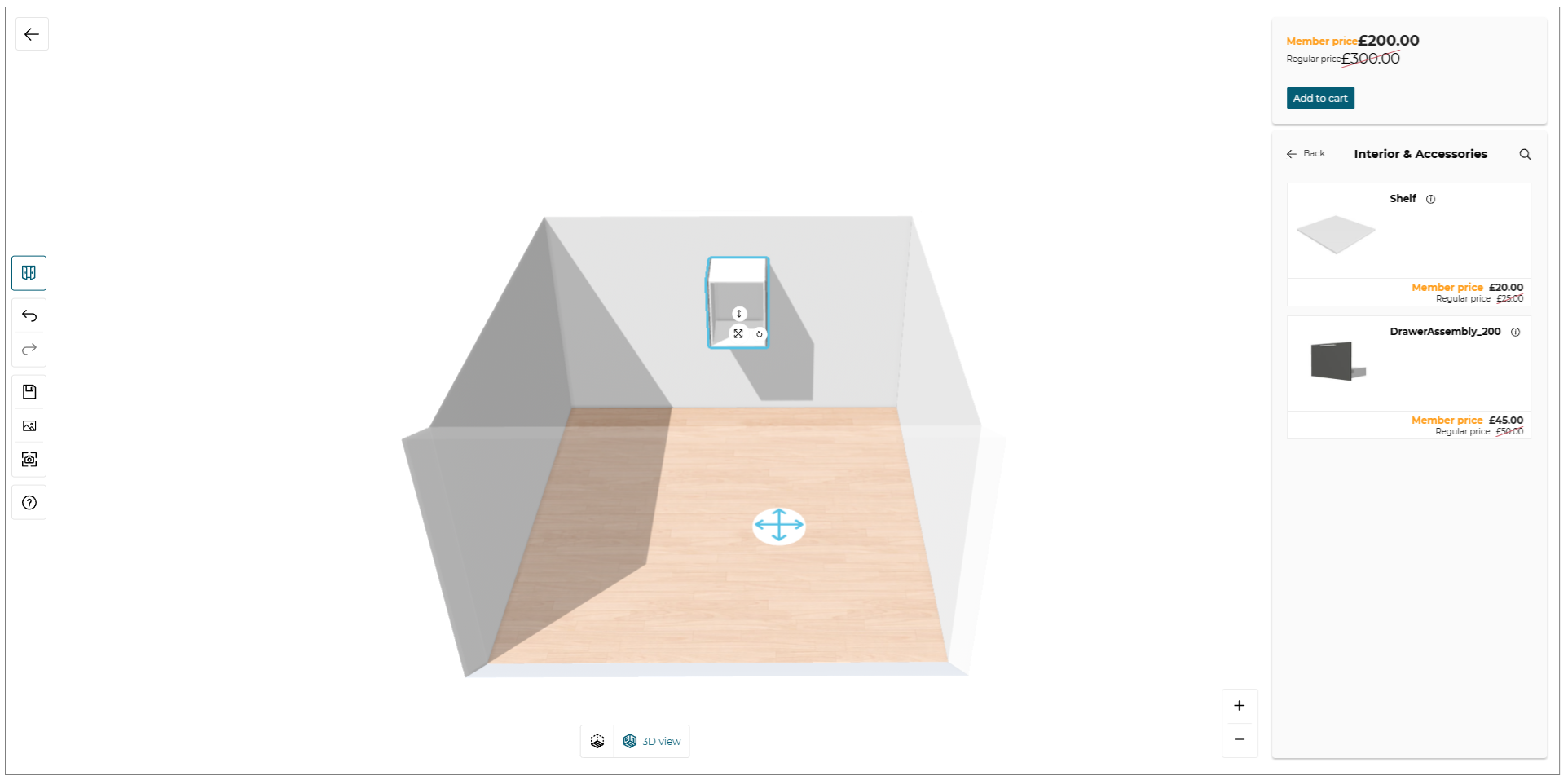
You can add directly a sub-component in the box by draging and droping it from the catalog.
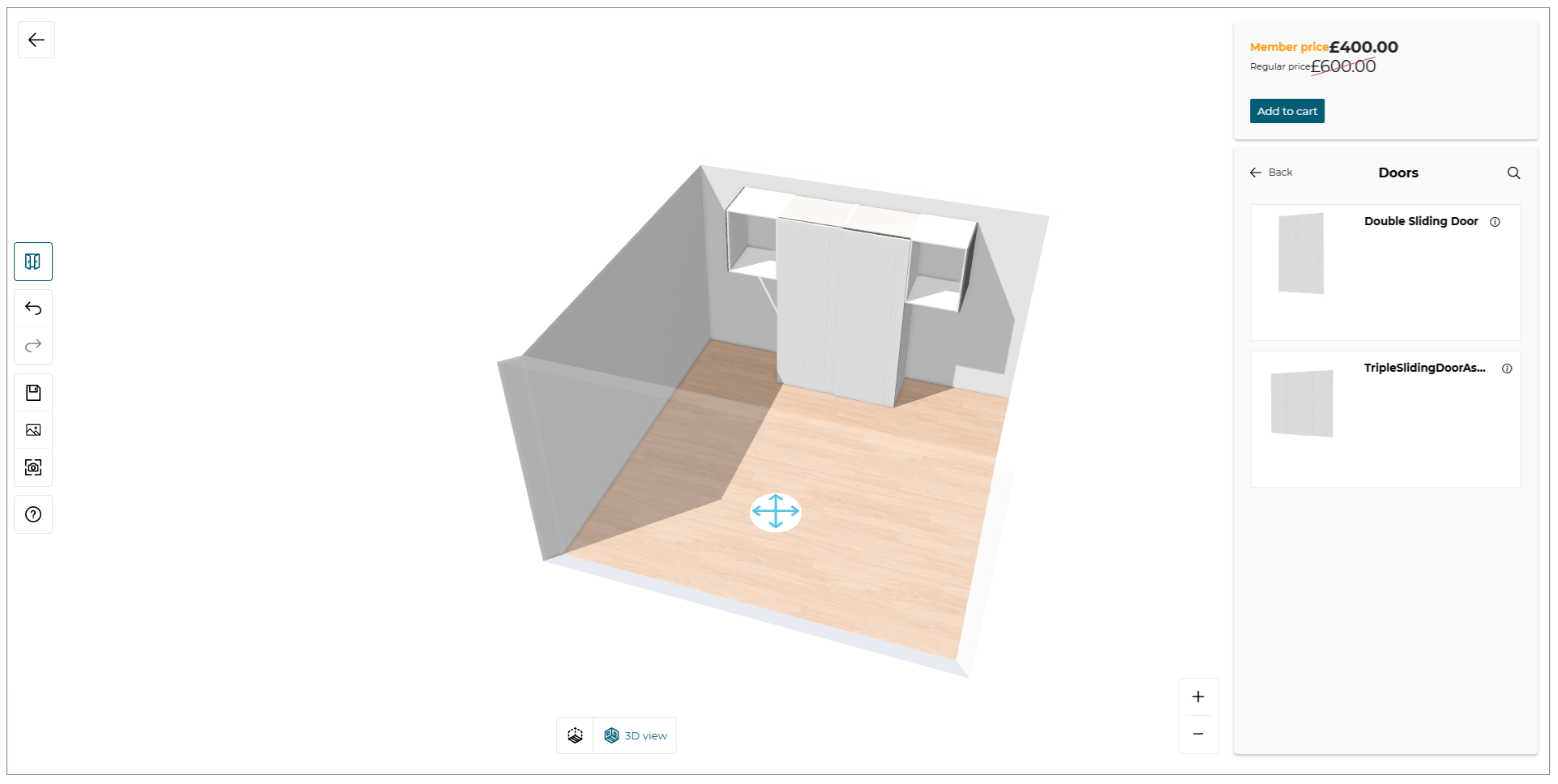
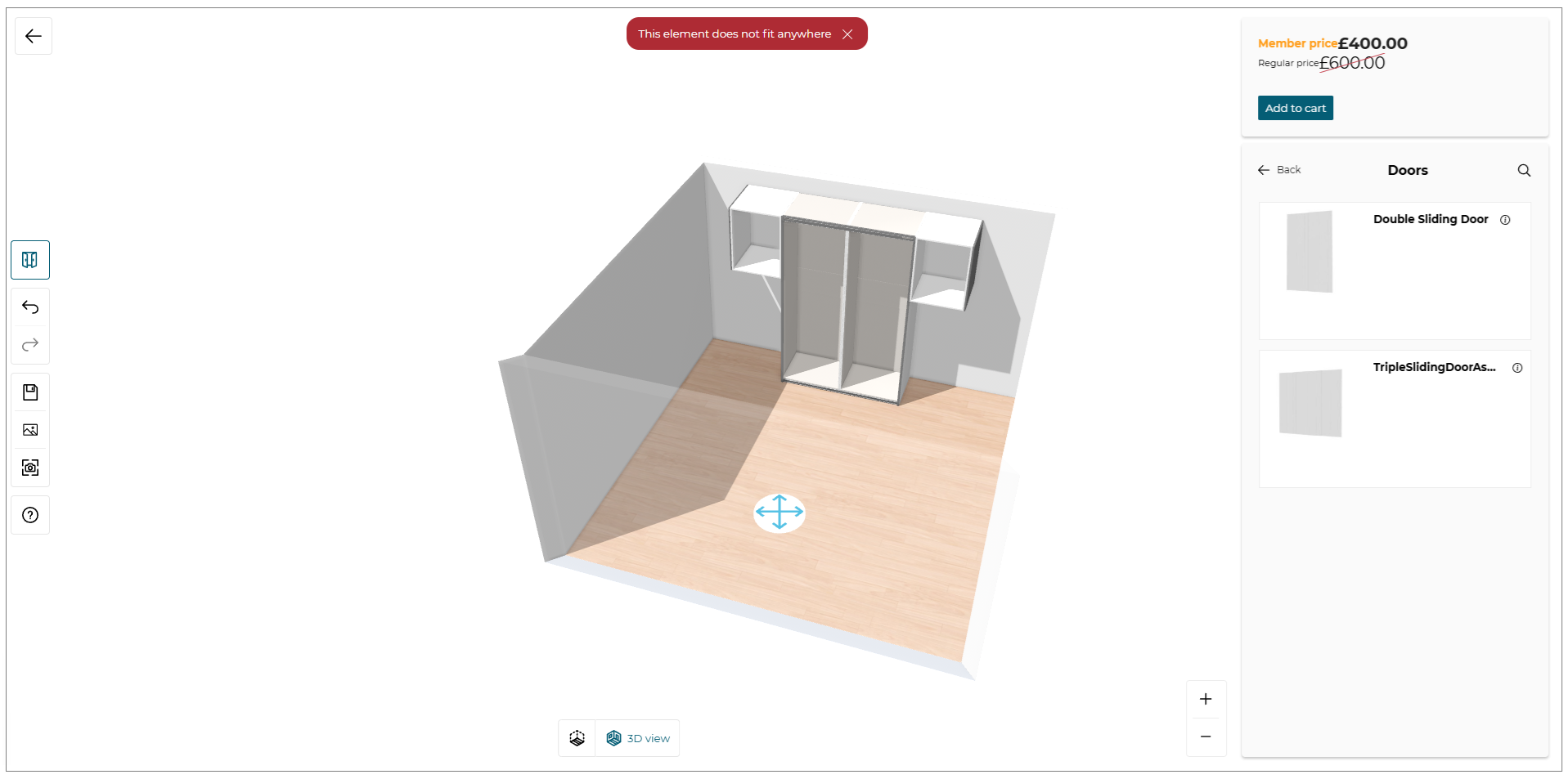
Add A Door
After adding a closet structure and several sub-components or accessories, you can add a door for your configuration if this door is compatible.
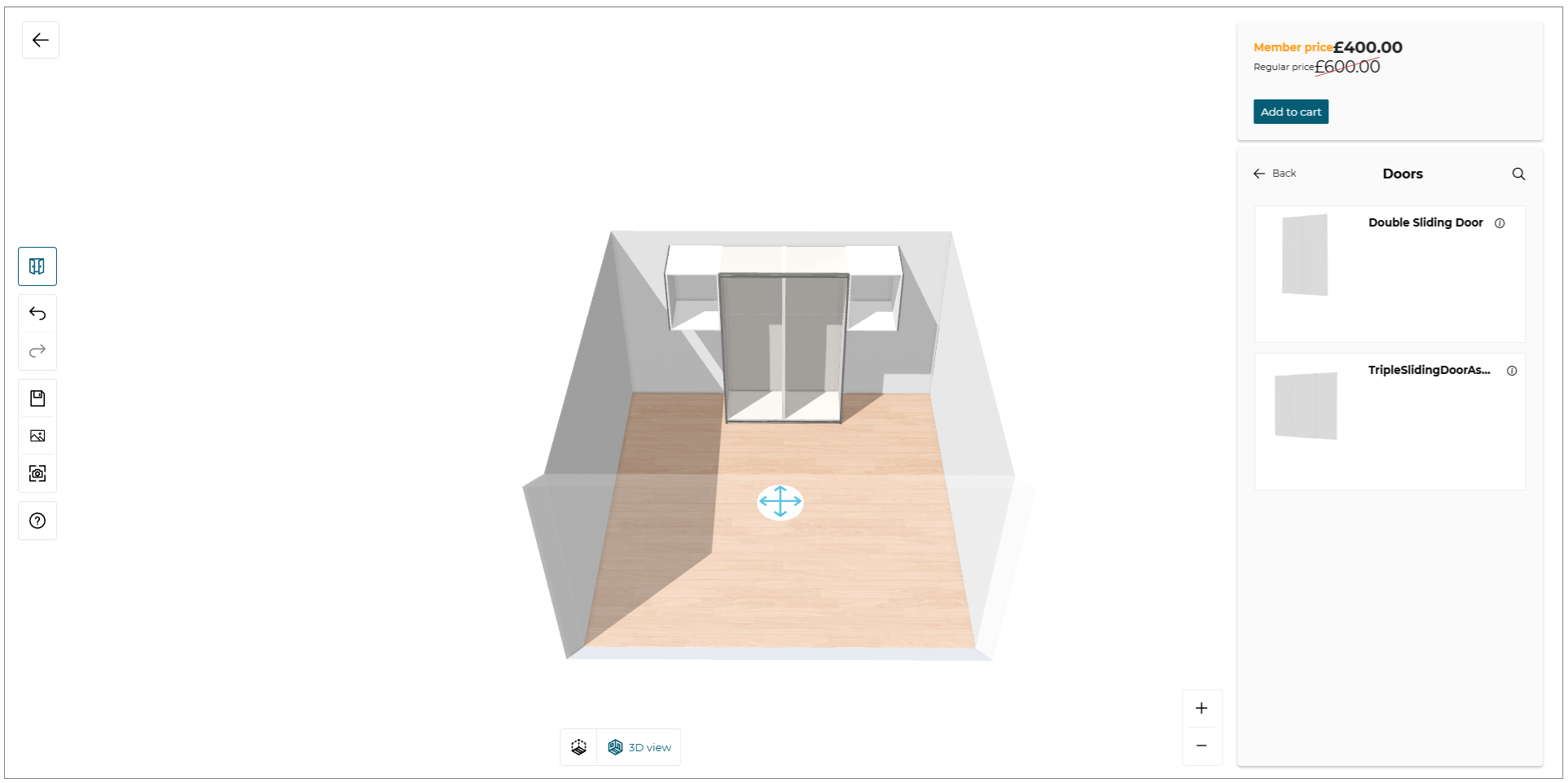
You can add directly a door on the configuration by draging and droping it from the catalog.
Align Sub-components (Equidistance)
The Align feature helps you evenly distribute selected sub-components vertically within a box, based on the available space.
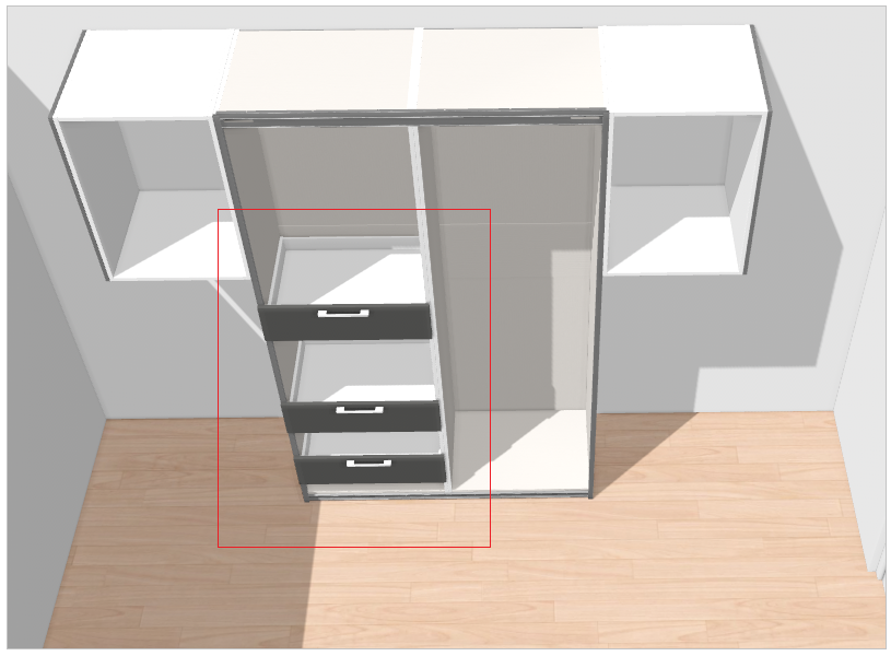
- Select the sub-components inside the box.
The Align option is displayed, as shown below:
When the Align option is available:
-
The Align button becomes active only when at least three sub-components are selected within the same box.
-
If fewer than three sub-components are selected, the Align button remains disabled.
-
If there is not enough available space in the box to reorganize the selected sub-components, the Align button is not available.
How the Align feature works:
When activated, the Align feature automatically reorganizes the selected sub-components so that they are evenly spaced vertically within the box.
The alignment is calculated based on predefined anchor points and layout constraints to determine the most suitable arrangement.
- Click the Align button.
The selected sub-components are automatically reorganized and evenly spaced vertically, as shown below:
When the Align option is unavailable
The Align button is disabled in the following cases:
-
Fewer than three sub-components are selected.
-
There is no available space in the box to distribute the sub-components.
-
Required sub-components are not selected, making automatic alignment impossible.
If the alignment operation cannot be completed, the following message is displayed:

This indicates that the system cannot calculate an equidistant layout and the sub-components must be adjusted manually.
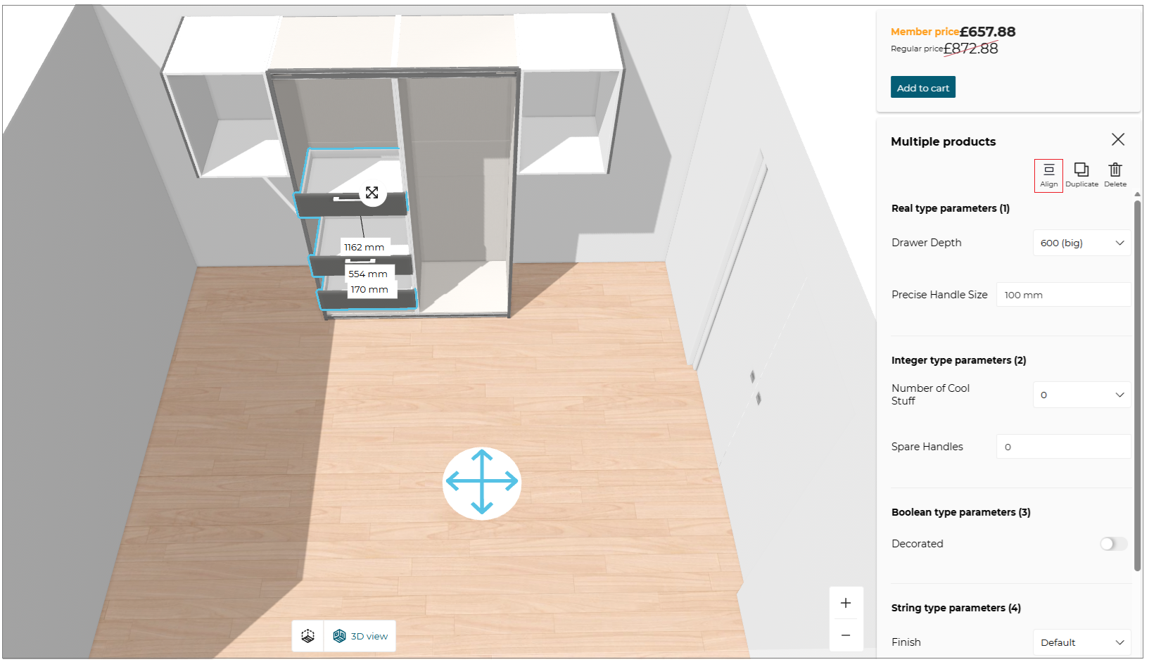
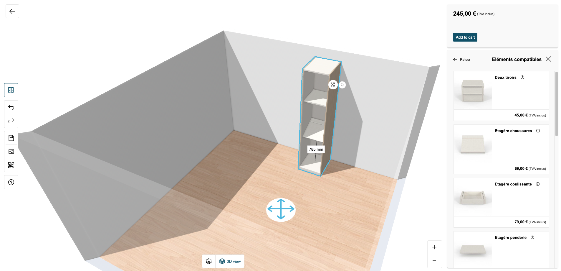
Dimensions
You can see the global dimensions of your configuration in width, height, and depth directly in the planner. These dimensions are always visible and are updated in real-time as you add, edit, or delete products.
Viewing Dimensions
-
Click the
 icon in the navigation panel, to activate the dimensions option.
 -
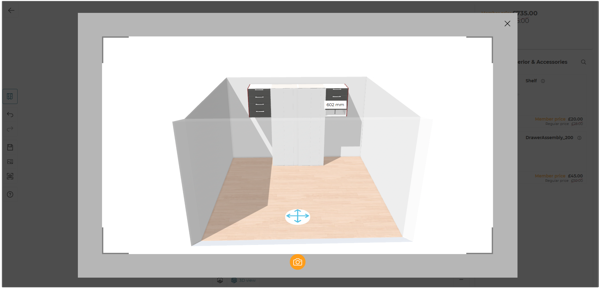
The dimensions are displayed in the planner, providing you with an overview of the overall size of your configuration. The dimensions are calculated based on the placement and size of all products in the scene, as shown below:
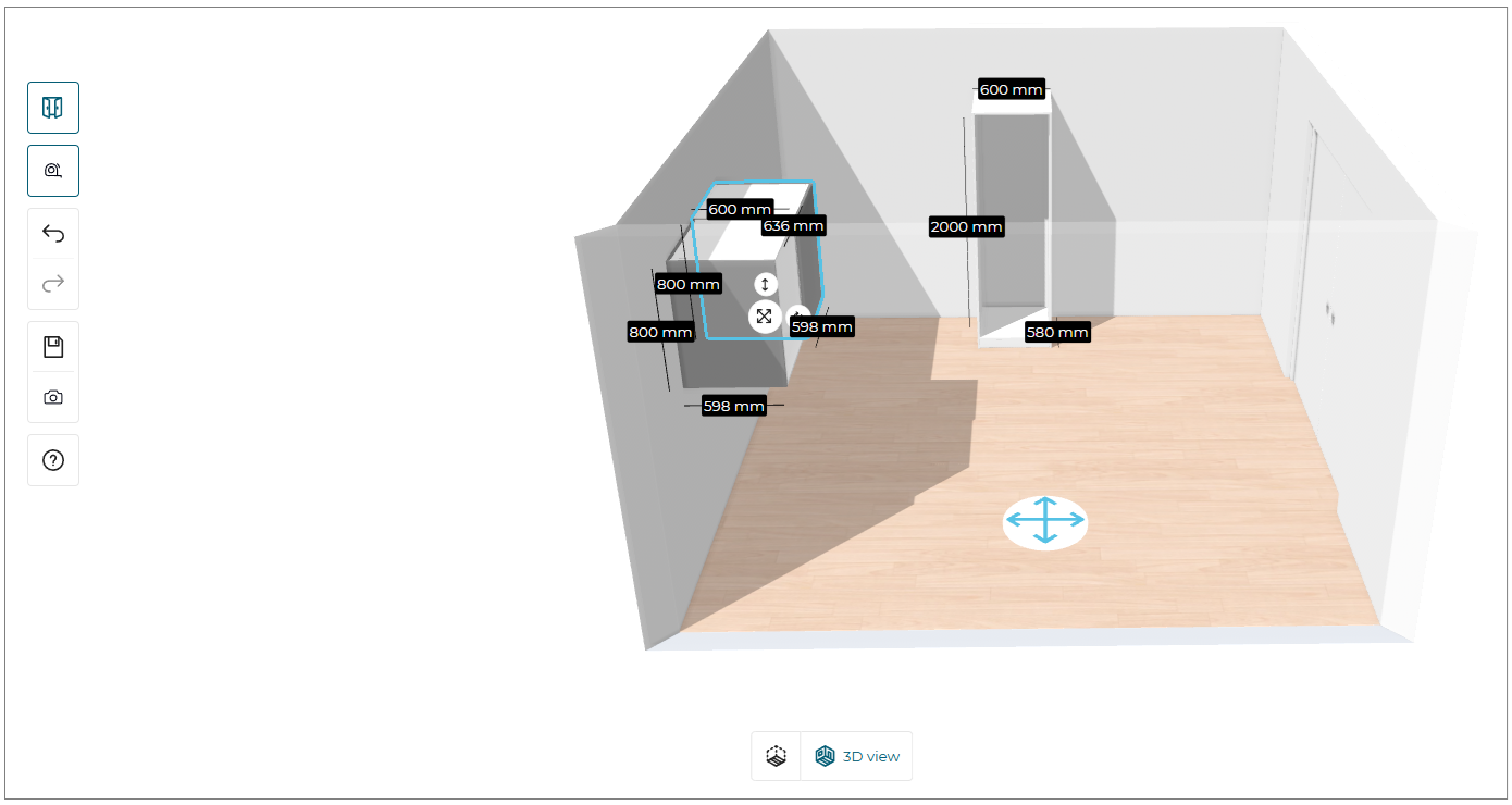
Real-Time Updates
The dimensions are updated in real-time as you interact with the planner. There is no need to refresh the page or click an option to see the updated dimensions. This ensures that you always have the most current information about the size of your configuration.
Here is an example of how the dimensions are displayed and updated:
- Initial Configuration: When you start a new configuration, the dimensions are not displayed until you add your first product.
- Adding a Product: As you add a product, the dimensions are calculated and displayed at the top of the planner.
- Editing a Product: If you change the size or position of a product, the dimensions are updated to reflect these changes.
- Duplicating a Product: When you duplicate a product, the dimensions are recalculated to include the additional product.
- Deleting a Product: If you delete a product, the dimensions are updated to reflect the removal of that product. If all products are deleted, the dimensions are removed from the display.
noteThe dimensions are displayed in 3D view only.
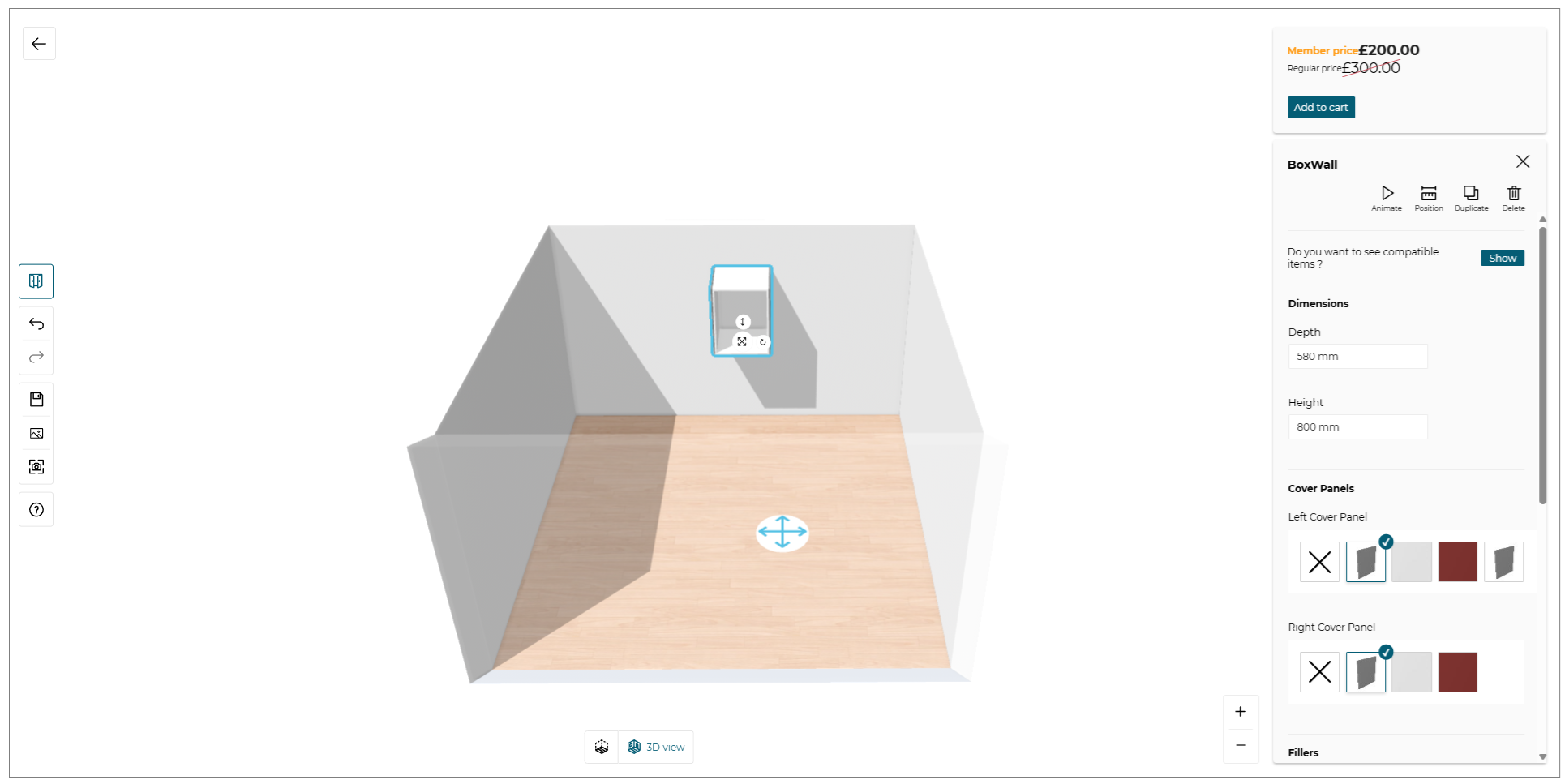
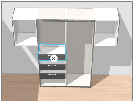
Edit A product
The Storage Configurator allows you to customize the products inserted in the configuration.
- Select the product, the edit options panel is displayed, as shown below:

| Option | Function |
|---|---|
 Animate | Animate the selected product. |
 Position | Position the selected product. |
 Duplicate | Duplicate the selected product. |
 Delete | Delete the selected product. |
Product Configuration Panel
Basic options
You can edit every options of a box, a subcomponent or an accessory.
- Edit options differ with type of product. Only editable features are displayed in the Product Configuration Panel.
To do so, first, select a product. The Product Configuration Panel is shown as follows:
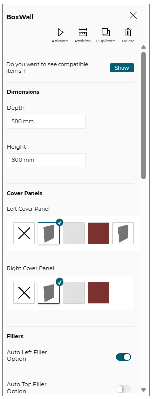
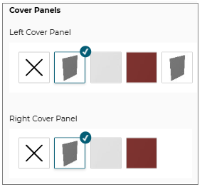
There are different options you can modify to customize your product.
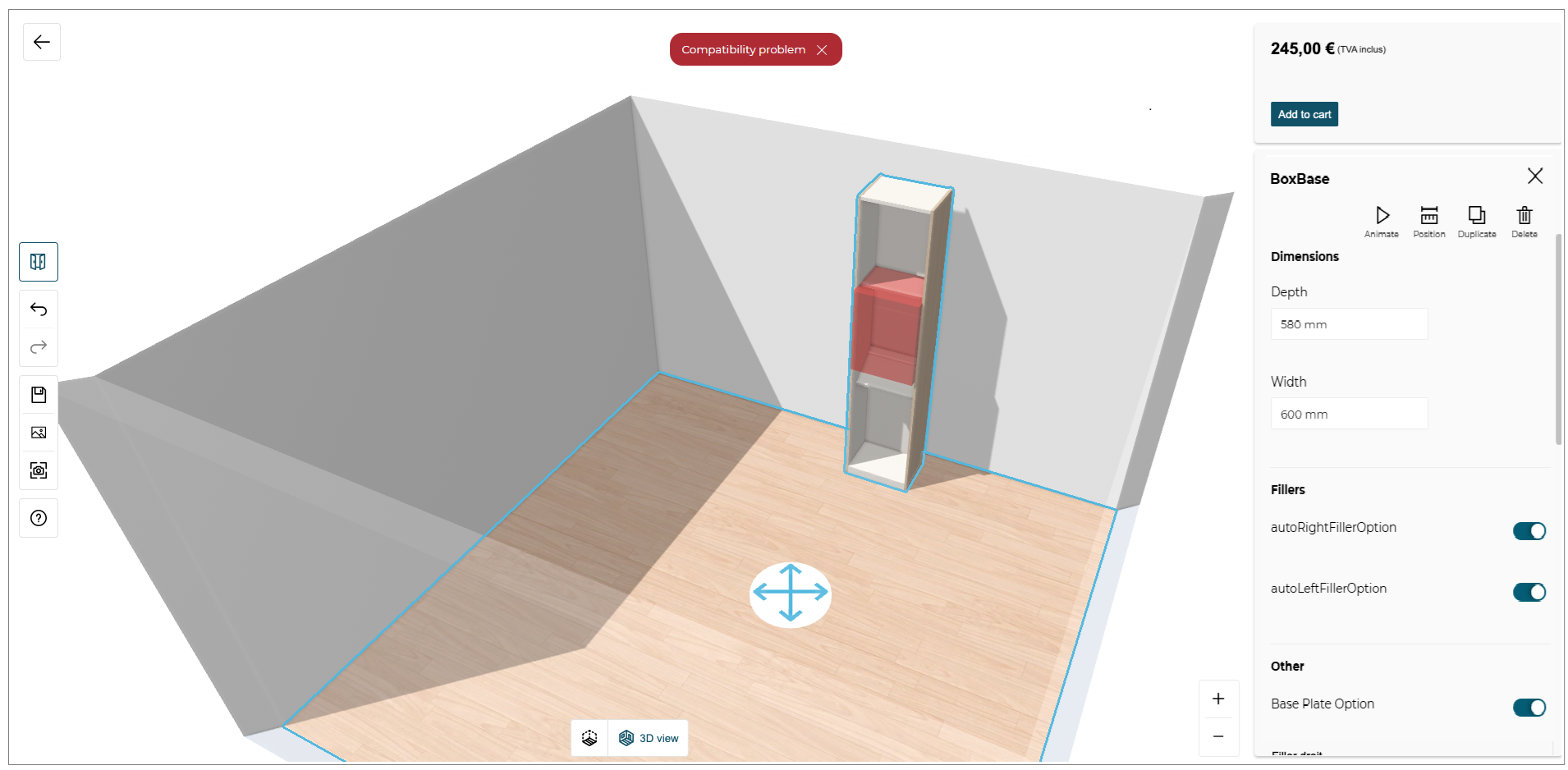
Dimensions section allows you to edit the width, depth and height dimensions of the product.

If the range maintainer defines several products attached to this box, several options are displayed and configurable in the panel, as shown in the example:
The default value is selected and represented in the first position of the list. If you want to remove this option, you need to click on the cross button. If you would like to see more products for this option, you need to click on View more button to display the catalog of available products.
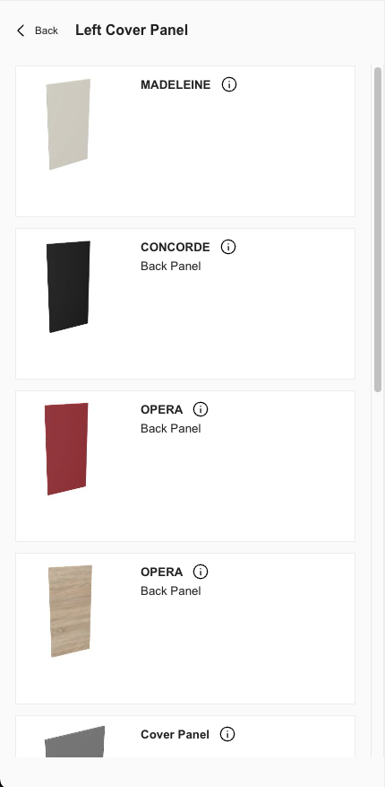
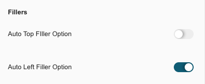
If the range maintainer defines several options activable or deactivable, we display a toggle button for these options.
Compatible Items
To help the user to build his configuration, we propose a feature to show compatible items such as sub-components and accessories for the selected box.

This feature is only available for top products (i.e. box, structure, etc.), it cannot be possible to show compatibilities between sub-components and accessories.
If you want to see the compatible products for a box or a structure, click on Show button and the dedicated catalog with compatible products is shown:
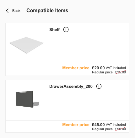
Drag and drop a product from this catalog and position it in the box you want.
Non-compatible Products Management
The Storage Configurator manages the non-compatible products. For example, if a sub-component is not compatible with a box, we will display a red notification to mention that this product does not fit anywhere when you try to insert a non-compatible product.
We also manage the non-compatibility when the configuration is already made and you want to change the dimensions of your box. If any sub-component or accessory is no longer compatible, we display a red notification to mention the compatibility issue and we highlight the impacted product in red.
Take a screenshot
When you finished your project, you can take a screenshot of your storage configuration by clicking on the dedicated button Take a screenshot in the left menu of the configurator.
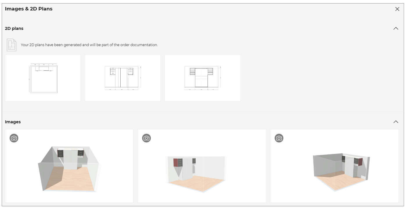
Media gallery
The Storage configurator standalone provides you a media gallery to see the different medias corresponding to your configuration. It can be the different views from 2D Plans and also the screenshots your previously took in your project.
Finalize My Configuration
When you have finished your Storage Configuration, you can click on Add to Cart button displayed at the top right of the configurator.

Your configuration is now sent and your can proceed to the purchase of your configuration directly in the client's website.