Parameters to Configure the Application Distribution
Each application distribution must define its own parameters in a JSON formatted object. This documentation describes the supported settings of the Home Retailers application that should be provided for any application distribution linked to the Home Retailers application.
You can find here 🔗 a complete JSON sample example of the Home Retailers application distribution settings.
❗ The JSON object cannot contain any comment.
Supported settings
| For... | See... |
|---|---|
| Language, Units and Currency | locale, locales, currencies |
| Search | aggregationParameters, sortBy, filters |
| Frame | sharingOptions |
| Materials | defaultWallMaterialID, defaultFloorMaterialID, exteriorFloorMaterials |
| Catalog | catalogEntries, pinPanel |
| Pricing | pricingOptions |
| Property Panel | propertiesPanelOptions, hideEditPanelParameters |
| Rendering | enableRender360, hqRendering,videoRendering |
| Brands | displayProductBrand |
| Feature | proceed, materialPricing, measureTool, minimizeWindow, favorites, upload3DModelID,FPImproved, annotations, floorPlanImport, technicalElements, hideExteriorWallsDimensions, shadingOption, niches |
| Widgets | projectOverview |
| Configurators | projectConfigurators |
Top structure
The application distribution settings object is defined with the following attributes:
| Attribute | Type | Description |
|---|---|---|
locales | array of objects | A list of supported locales in the application distribution |
locale | string | The default locale to use from the array of locales |
currencies | array of objects | A list of supported currencies in the application distribution |
pricingOptions | object | Application distribution settings related to the pricing |
marketZone | string | The market zone attributed to the application distribution |
catalogEntries | object | Application distribution settings related to the catalog entries |
catalog | object | Application distribution settings related to the configuration of the catalog |
propertiesPanelOptions | object | Application distribution settings related to the product edit panel |
hideEditPanelParameters | array of strings | Application distribution settings related to the product edit panel |
defaultWallMaterialID | string | The default wall material |
defaultFloorMaterialID | string | The default floor material |
exteriorFloorMaterials | object | The default exterial materials |
feature | object | Application distribution settings to enable & configure different features in the planner |
search | object | Application distribution settings related to the search |
widgets | object | Application distribution settings to configure the default widgets |
sharingOptions | array of objects | A list of supported project sharing options |
projectConfigurators | array of objects | A list of external project configurators attached to the application distribution |
displayProductBrand | boolean | An option to show/hide the products brand |
enableRender360 | boolean | An option to enable/disable the 360 renders |
hqRendering | object | An option to enable/disable and configure the HQ renders |
videoRendering | boolean | An option to enable/disable the video renders |
The only mandatory attributes are : defaultWallMaterialID, defaultFloorMaterialID and exteriorFloorMaterials.
locales
| Status | Type | Default value |
|---|---|---|
| Mandatory | array of locale objects | [] |
This parameter contains the list of supported locales for the Application Distribution. It must contain at least one element.
A locale object is defined as follow:
| Attribute | Type | Mandatory | Description |
|---|---|---|---|
name | string | YES | A combination of a mandatory and an optional element joined in a string and separated by a "-" (dash). - MANDATORY: 2-letter code of a language, following 🔗 ISO 639-1. - OPTIONAL: 2-letter code of a region / country, following 🔗 ISO 3166-1. Examples: "da-DK" for "Danish-Danemark" or "fr-FR" for "French-France" or "PT-pt" for "Poruguese-Portugal". |
fallback | string | NO | Used for translations only. If a translation key is not found for the given locale, the translation system falls back to this locale instead. If not specified, falls back to English. |
unitSystem | string | YES | Defines which unit system is used in the application. Can be metrics or imperial |
lengthUnit | string | YES | Defines the base unit for length in the application. Can be millimeter, centimeter, decimeter or meter (for unitSystem = metrics) and inch, foot or yard (for uniSystem = imperial) |
lengthPrecision | integer | YES if uniSystem is metrics | The various lengths displayed in the application will be displayed with lengthPrecision decimal digits |
lengthFractionPrecision | integer | YES if uniSystem is imperial | Minimal fraction of lengthUnit. Valid values are: 8, 16 or 32 |
Example
{
    "locales":
    [
        {
            "name": "fr-BE",
            "unitSystem": "metrics",
            "lengthUnit": "millimeter",
            "lengthPrecision": 0,
            "fallback": "en"
        },
        {
            "name": "en-US",
            "unitSystem": "imperial",
            "lengthUnit": "foot",
            "lengthPrecision": 0,
            "lengthFractionPrecision": 16,
            "fallback": "en"
        },
        {
            "name": "de-DE",
            "unitSystem": "metrics",
            "lengthUnit": "millimeter",
            "lengthPrecision": 0,
            "fallback": "en"
        }
    ]
}
locale
Mandatory parameter – Value type: string
Name of the default locale for this Application Distribution. It must match the name of one of the defined available locales. Example: "en-US"
currencies
| Status | Type | Default value |
|---|---|---|
| Optional | array of currency objects | [] |
This parameter contains a list of specific currency configurations for the Application Distribution. Each object in this array is used to configure how a particular currency is configured for its display in the application.
When the application starts, it determines which currency to use (see currency URL param 🔗). If it is in this list of currencies, it uses the associated object to configure the currency display. If the currency is not in the currencies list, it fallsback on the locale-currency configuration (see GET /applications/{id}/currencylocales/{locale} 🔗).
A currency object is defined as follow:
| Attribute | Type | Mandatory | Description |
|---|---|---|---|
currencyCode | string | YES | A 3 letters string following 🔗 ISO 4217 |
currencyName | string | YES | The currency name |
numberSystem | string | YES | "latin" or "arab". Defines which alphabet to use to display the digits |
currencySymbol | string | YES | The symbol to display for the currency |
currencySignRighthand | boolean | YES | Defines if the currency symbol should be on the right side of the price number. true to display the symbol on the right side |
currencySpacing | boolean | YES | Defines if there should be a space between the price number and the currency symbol. true to display a spacing |
decimalSeparator | string | YES | The separator string to separate the decimal digits of the price |
thousandSeparator | string | YES | The separator string to separate the thousand groups |
noDecimalString | string | YES | The string to display when there is no decimal digits |
Example 1 – Array of two currencies
{
    "currencies": [
        {
            "currencyCode": "GBP",
            "currencyName": "British Pound",
            "numberSystem": "latin",
            "currencySymbol": "\u00a3",
            "currencySignRighthand": false,
            "currencySpacing": false,
            "decimalSeparator": ".",
            "thousandSeparator": ",",
            "noDecimalString": ""
        },
        {
            "currencyCode": "EUR",
            "currencyName": "euro",
            "numberSystem": "latin",
            "currencySymbol": "\u20ac",
            "currencySignRighthand": true,
            "currencySpacing": true,
            "decimalSeparator": ",",
            "thousandSeparator": " ",
            "noDecimalString": ""
        }
    ]
}
pricingOptions
The pricingOptions object can contain the keys / pairs below.
priceTopAssembly
Optional key – Value type: boolean
The default value is "false".
Indicates whether the assembly product prices should include the price of the top assembly or not.
This only affects assembly products (i.e. BMA products), single component products (i.e. BM3 products) are always priced with their own price.
assemblyCatalogPrice
| Status | Type | Default value |
|---|---|---|
| Optional | boolean | true |
Set to false if you want to hide the product prices that are displayed in the different catalog browsers in the planner. It only affects assembly products (i.e. BMA products). Even if set to true, the price of the products that are not assemblies (i.e. single component products corresponding to BM3 files) will be displayed in the catalog browser (accessories, etc.).
nonAssemblyCatalogPrice
| Status | Type | Default value |
|---|---|---|
| Optional | boolean | true |
Set to false if you want to hide the product prices that are displayed in the different catalog browsers in the planner. It only affects non assembly products (i.e. BM3 products). Even if set to true, the price of the products that are assemblies will be displayed in the catalog browser.
useExternalPriceEngine
Optional key – Value type: boolean
The default value is "false".
Set to true if you want to use an external module to compute the total price. By choosing this option, after each BOM computation, the planner sends it via an iframe message 🔗 and waits for a reply that must contain the total price to display in the UI.
hide
| Status | Type | Default value |
|---|---|---|
| Optional | boolean | false |
Defines whether the total project price is displayed or not in the application.
By default the value of "hide" is false, which means total project price will be displayed in the application.
priceDecoByRoom
| Status | Type | Default value |
|---|---|---|
| Optional | boolean | false |
| Determines whether the pricing of decoration products is calculated based on the total area of all rooms combined or separately for each individual room. By default, this setting is false, indicating that the price is calculated using the total area across all rooms. When set to true, the price is determined independently for each room, and the BOM will include room-specific details such as room name and type for each decoration product. |
lowestPrice
| Status | Type | Default value |
|---|---|---|
| Optional | integer | null |
This parameter is used to display pricing to enhance consumer decision-making by adding the lowest price from the last 30 days in products and widgets.Integer 30 is the value that lowestPrice holds.
showSecondaryCurrencyPrice
| Status | Type | Default value |
|---|---|---|
| Optional | boolean | false |
This parameter is used to display dual currencies in the planner to support dual currency regulation.
secondaryCurrency
| Status | Type | Default value |
|---|---|---|
| Optional | string | "" |
Defines a secondary currency to include in the BOM computation. The expected value for this parameter is the currency code (3 characters) of your secondary currency. If this setting corresponds to a valid currency, a second price value is appended in the BOM for each product that is priced in this secondary currency. The total project price is also computed in both currencies.
Note: you also have to set the BOM version to 11 or above. See the BOM documentation.
Example
"pricingOptions":
    {
        "priceTopAssembly": true,
        "useExternalPriceEngine": false,
        "assemblyCatalogPrice": true,
        "nonAssemblyCatalogPrice": true,
        "hide": false,
        "priceDecoByRoom": false,
        "lowestPrice": null,
        "showSecondaryCurrencyPrice":false,
        "secondaryCurrency":""
    },
marketZone
Optional parameter – Value type: string
This parameter is used to define the catalog as well product prices that users can view for a given market zone in Home Retailers as well as the external configurators.
It can also be provided though an url parameter in which case it will override the application distribution parameter value. See here 🔗 for a complete description of how to use this parameter.
catalogEntries
This object is used to configure the different catalog entries that are displayed in the planner. The illustrations below show the hierarchy of the catalog entries (in the Home Planner).
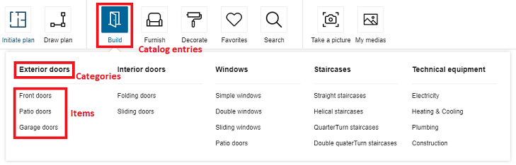
Then, the structure of data is the following:
- The first level of definition is the catalog entry. Only this level has an icon.
- The second level is the category. It is displayed as menu header in the planner.
- The third level is the sub-level of the menu, i.e. the menu item.
catalogEntry (first level, with picto) e.g. "Building"
	|
	|__ category (second level) e.g.`exterior doors`
	|	|
	|	|__ item (third level) e.g. `frontDoors`
	|	|
	|	|__ item (third level) e.g. `patioDoors`
	|	|
	|	|__ item (third level) e.g. `garageDoors`
	|	|
	|__ category (second level) e.g. `interior doors`
	|	|
	|	|__ item (third level) e.g. `foldingWindow`
	|	|
	|	|__ item (third level) e.g. `slidingDoors`
	|	|
	|__ category (second level) e.g. `windows`
	|	|
	|	|__ item (third level) e.g. `simpleWindows`
	|	|
	|	|__ item (third level) e.g. `doubleWindows`
	|	|
	|	|__ item (third level) e.g. `slidingWindows`
About the Icons
Each category entry is illustrated by an icon; some icons are fixed and others are customizable.
"Customizable" icons means that you can choose to have them or not.
"Customizable" does not mean that you can add your own icons. The ID of the icons point to an internal file.
📌 The code does not limit the number of icons, but there is a design limit: There is a risk that the pricing area blocks the expansion to the right of the icon area.
The catalogEntries object can contain the keys / pairs below.
Definition of the Catalog Entries
This level is the only one that has pictos.
picto
Mandatory key – Value type: string
The name of the SVG picto that will be used to represent this catalog entry.
translationKey
Mandatory key – Value type: string
The keys in the translation file corresponding to the translation of the catalog entry. The path to these translation keys is built by the code.
For example
"building": [
    {
        "picto": "windows",
        "categories": [
            {...}
        ],
        "translationKey": "windows"
    }
]
In this example, the complete translation key that must be in the translation find is navigation_catalog.building.windows.
How deep is the key does not impact the final key. A same key can be used an many different levels.
categories
Mandatory key – Value type: array
Define in this array all the categories depending on the catalog entry.
Definition of the Categories
This level depends on the previous one and will be displayed as a menu in the planner. It is the first level of navigation.
translationKey
Mandatory key – Value type: string
Translation key. See above.
categories
Mandatory key – Value type: array
Define in this array all the subcategories below these categories.
Definition of the Items
The last level is the second level of navigation, i.e. the items in the menu.
translationKey
Mandatory key – Value type: string
Translation key. See above.
closedTags
Mandatory key – Value type: array
List of closed tag IDs that will be searched if the user clicks on that category.
The search made depending of the closedTags is a search of type OR.
For example: In this case, the search will browse all the products having the closedTags 253 OR 254.
{
    "translationKey": "sliding_windows",
    "closedTags": [253, 254],
    "freeTags": []
}
In this other example, clicking "Double windows" will start a search on all the products having the closedTag 252; clicking "Simple Window" will start a search on products having the closedTag 251, etc. But clicking on "Windows" will start a search on all the sub-categories, including tags 251, 252, 253 and 254.
{
    "translationKey": "window",
    "categories": [
        { "translationKey": "double_windows", "closedTags": [252], "freeTags": [] },
        { "translationKey": "simple_windows", "closedTags": [251], "freeTags": [] },
        { "translationKey": "sliding_windows", "closedTags": [253, 254], "freeTags": [] }
    ]
}
freeTags
Mandatory key – Value type: array
List of free tag IDs that will be searched if the user clicks on that category.
The search made depending of the freeTags is a search of type OR. The operation is the same as for the closedTags, except that freeTags are strings while closedTags are integers.
Complete Example
The translationKey windows in the example below has multiple categories in the second level as a result, as illustrated:
catalogEntries impacts the catalog browser: the browser uses them to browse the catalog. The translationKey windows has two categories simple_windows, double_windows and sliding_windows that are displayed in the planner, as illustrated:

"building": [
    {
        "picto": "windows",
        "categories": [
            {
                "freeTags": [],
                "closedTags": [
                    251
                ],
                "translationKey": "simple_windows"
            },
            {
                "freeTags": [],
                "closedTags": [
                    252
                ],
                "translationKey": "double_windows"
            },
            {
                "freeTags": [],
                "closedTags": [
                    253,
                    254
                ],
                "translationKey": "sliding_windows"
            },
        ],
        "translationKey": "windows"
    }
],
Upload 3D Model : To display the upload button and uploaded content options this object needs to be added is displayed below.
{
    "picto": "3d_content",
    "categories": [
        {
            "translationKey": "import_content_3d"
        },
        {
            "categories": [],
            "translationKey": "my_content"
        }
    ],
    "translationKey": "3d_content"
}
catalog
This object is used to configure catalog behaviors in the planner. It supports the following parameters.
pinPanel
| Status | Type | Default value |
|---|---|---|
| Optional | boolean | true |
Defines if the search bar panel remains visible when the user adds any product in the scene (with drag and drop or click).
The default value for the key is true. If no value is provided for the key, by default the search bar panel will be visible after product insertion.
propertiesPanelOptions
This object defines how to display the properties of a product depending on the context (the first definition level of the object) and the type.
The data structure of the propertiesPanelOptions object is the following.
propertiesPanelOptions
|____ DefaultState (array)
|        |__ types (array of strings)
|        |__ presentation
|        |     |__ parameter 1
|        |     |      |__ parameter
|        |     |__ parameter 2
|        |     |      |__ parameter 1
|        |     |      |__ parameter2
|        |     |__ parameter 3
|        |     |      |__ parameter 1
|        |     |      |__ parameter 2
|        |     |      |__ parameter 3
|        |     |__ parameter 4
|        |     |__ parameter 5
The object can contain the keys / pairs below.
defaultState
Optional key – Value type: array
Use types to define the way the properties will be displayed in the home application, in the main state.
types
Mandatory key – Value type: array of integers
An array of closed tag IDs. If empty, it means that this presentation is for all type of products (closed tag type) that do not have a more specific presentation defined. If not empty, this presentation will represent all products matching one of the closed tags in the list.
presentation
Mandatory key – Value type: object
Define the list of parameters in the right order.
Each presentation contains the following kind of properties:
- groups – array – Optional. In this array you will define grouping of parameters.
- parameters – array – Mandatory. This array is made of objects that define a parameter and its possible sub-options. The property panel in the planner will use the order that you define in this array. If a parameter in a product is visible but does not appear in parameters or groups array, it will be display after all parameters define by those list.
General Example
    "types": [],
    "presentation": {
        "parameters": [
            {
                "id": "depth"
            },
            {
                "id": "width"
            },
            {
                "id": "height"
            }
        ]
    }
In this example, you have a defined presentation that works for any type of product. In this presentation, there are three main parameters that we want to show first.
- The first one is the parameter depth.
- The second one is the parameter width.
- The third one is the parameter height.
hideEditPanelParameters
This object defines, which properties to be excluded from properties panel.
The data structure of the hideEditPanelParameters object is the following.
hideEditPanelParameters
|____ backCoverPanel
|____ leftCoverPanel
|____ rightCoverPanel
defaultWallMaterialID
Mandatory key – Value type: string
Define the wall material that will be used by default when adding a wall or a room. For example:
"defaultWallMaterialID": "4755",
defaultFloorMaterialID
Mandatory key – Value type: string
Defines the floor material that will be used by default when adding a new room. For example:
"defaultFloorMaterialID": "4296"
exteriorFloorMaterials
Mandatory key – Value type: object
This object defines the floor materials that will be proposed to the users when adding an exterior for a garden, a terrace or a driveway.
garden / terrace / driveway
Mandatory keys – Value type: string
Each key will define the floor material for the matching exterior.
For example:
"exteriorFloorMaterials":{
    "garden":"74526",
    "terrace":"GENERIC_MATERIAL_01324",
    "driveway":"GENERIC_MATERIAL_00463"
},
feature
The feature attribute groups settings used to enable/disable specific features of the planner.
annotations
Optional keys – Value type: boolean or object
When set to a boolean it defines whether the annotations feature is available. By default its value is false.
If set to an object, annotations feature is available. The configuration object supports the following key/values pairs:
imageUpload
| Status | Type | Default value |
|---|---|---|
| Optional | boolean | true |
The imageUpload sub-attribute controls the avalibility of image section in annotations. By default it will be available.
technicalElements
| Status | Type | Default value |
|---|---|---|
| Optional | boolean | true |
The technicalElements sub-attribute controls the avalibility of technical elements section in annotations. By default it will be available.
Example
"annotations": {
        "imageUpload": true,
        "technicalElements": true
    }
proceed
Optional keys – Value type: boolean
Defines whether the add to cart button at home retailers home page, footer and total price from project overview pop-up should be displayed or not.
By default its value is true, which means add to cart button at home retailers home page, footer and total price from project overview pop-up will be displayed in the application and when we set this to false, it will not be displayed in the application.
materialPricing
Optional keys – Value type: boolean
Defines whether the material products in the item list should be displayed or not.
By default the value of "materialPricing" is true, which means material products in the item list will be displayed and priced. When we set materialPricing to false, material products will not be displayed in the item list and will not be priced.
hideExteriorWallsDimensions
Optional keys – Value type: boolean
Defines whether the Exterior Walls Dimensions of floor should be displayed or not.
By default the value of "hideExteriorWallsDimensions" is true. When we set hideExteriorWallsDimensions to true, Exterior Walls Dimensions of floor will not be displayed.
shadingOption
Optional keys – Value type: boolean
Defines if the shading option is available in the application.
By default the value of "shadingOption" is false. If enabled and set to true, shadows are rendered in the 3D scene.
niches
Optional keys – Value type: boolean
Controls if the user has the options to add Niche feature on the wall.
By default the value of "niches" is false. If enabled and set to true, Niche feature will be available on the wall.
favorites
Optional keys – Value type: boolean
Defines if the favorites is available for the user.
By default the value of the "Favorites" is true, which means the favorites action will be present by default in the application, Retailer can choose to disable this feature by setting its value to 'False'.
measureTool
Optional keys – Value type: boolean
Defines whether the measuring tool in the planner header should be displayed or not.
By default the value of "measureTool" is false, which means measuring tool will not be displayed in the planner header.
minimizeWindow
Optional keys – Value type: boolean
Defines whether the minimize button in the planner header should be displayed or not.
By default the value of "minimizeWindow" is false, which means minimize button will not be displayed in the planner header.
upload3DModelID
Optional parameter – Value type: string
Value of the ID created in 3D cloud under the external configurators section for the editor url that gets loaded to import 3D content.
Also, we need to add a catalog entry to display the upload button and uploaded content options in the menu. Detailed object is given in catalogEntries.
📌 If not set, the 3D editor won't get loaded. As it uses the url given under the object fetched using the ID.
Example
"upload3DModelID": "3dEditor"
FPImproved
| Status | Type | Default value |
|---|---|---|
| Optional | boolean or object | false |
The FPImproved sub-attribute controls whether the walls will be hidden in First Person View while taking a Realistic Picture.
If we need to add distance from where the wall should disappear we will need to use following object
"FPImproved" :{
   "viewPointToWallDistance" : 10000,
   "hideFurnitureWithWall" : true
}
If we don't use the above object but just add true in the value, the default value will be 1000mm
floorPlanImport
| Status | Type | Default value |
|---|---|---|
| Optional | object | { planMeasure: false } |
Defines options related to planner import capabilities.
It supports the following key/value pairs.
planMeasure
| Status | Type | Default value |
|---|---|---|
| Optional | boolean | false |
Defines whether the measure service is enabled or disabled. If set to true, the measure service is displayed to the user in the Initiate Plan menu.
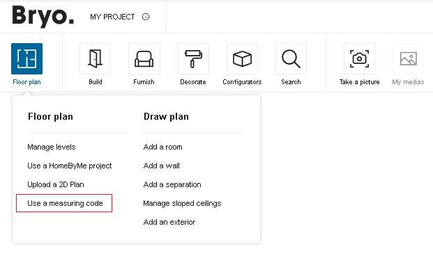
Example
"floorPlanImport": {
    "planMeasure": false
}
technicalElements
| Status | Type | Default value |
|---|---|---|
| Optional | boolean | false |
Controls if the user have the options to add cornice, picture rail and baseboard.
search
The search attribute groups aggregation parameters related to the search request.
These aggregation parameters are used in the product browser, replace catalog and the search bar.
aggregationParameters
| Status | Type | Default value |
|---|---|---|
| Optional | array of string | [] |
For a parameter to be used as a filter, it must be set as a searchable parameter on the product(s) and defined in the API and in application distribution parameters in 3dcloud.
➡️ See the Searchable Parameters 🔗 for a further explanation of how to set the parameters.
{
    "search":{
        "aggregationParameters": [
            "commercialDepth",
            "commercialWidth",
            "brands",
            "commercialMaterial",
            "repairabilityindex",
            "durabilityIndex"
        ],
    }
}
sortBy
| Status | Type | Default value |
|---|---|---|
| Optional | array of objects | [] |
List of the sort by options for new filters panel. Each item in the array contains two attributes:
key(mandatory): defines the sort by option value. The possible values are:byName,byStartDate, andbyProductRank.byName: sort by the name of the product.byStartDate: sort by the start date of the product.byProductRank: sort by the score of the product (See Product Rank for catalog search 🔗 for detailed information on product ranking).
isDefault(optional): defines if the current sort by option will be applied by default.
Note: The order of the sort by options shown in the panel will be exactly the same order defined in the array. If none of the items have the
isDefaultvalue, the first item will be applied as the default sort by option.
{
    "sortBy":
    [
        { "key": "byName", "isDefault": true },
        { "key": "byStartDate" },
        { "key": "byProductRank" }
    ]
}
filters
| Status | Type | Default value |
|---|---|---|
| Optional | array of objects | [] |
List of the filter options for new filters panel. Each item in the array contains two attributes:
key(mandatory): defines the filter option. It can be either a filter option proposed by default or a custom filter (defined by searchable parameter). There are six filter options proposed by default:brands: filter by the brands value of a product.closed_tags_type: filter by the type closed tag of a product.closed_tags_style: filter by the style closed tag of a product.closed_tags_material: filter by the material closed tag of a product.closed_tags_color: filter by the color closed tag of a product.closed_tags_room: filter by the room closed tag of a product.
order(optional): define the sort order of the filter values. By default, the values are sorted in ascending order. If the value isdesc, it will be sorted in descending order.
Note: If the
filtersvalue is set, the planner will ignore the settingaggregationParameters. The order of the filters shown in the panel will be exactly the same order defined in the array.
Note: To use six filter options proposed by default, you need to add the translation for them. To do so, you need to provide the translation values in "catalog" part of the translation file. Here is an example of translations:
{
    "catalog": {
        ...,
        "default_agg": {
            "brands": "Brands",
            "material": "Material Tag",
            "style": "Style",
            "type": "Type",
            "room": "Room",
            "color": "Color"
        },
        ...
    }
}
Note: For a custom filter, it can be shown as a customized color chip in the filters panel. The color is defined as the value of the searchable parameter and the value should be a valid hexadecimal color code (such as “#86252e”).
An example of filters option:
{
    "filters": [
        { "key": "brands" },
        { "key": "commercialDepth", "order": "desc" },
        { "key": "commercialWidth", "order": "desc" },
        { "key": "commercialMaterial" },
        { "key": "commercialColor" },
        { "key": "closed_tags_type" },
        { "key": "closed_tags_style" },
        { "key": "closed_tags_material" }
    ]
}
widgets
The widgets attribute is used to configure the use of default widgets in the application. It contains a key for each supported widget in the application.
projectOverview
| Status | Type | Default value |
|---|---|---|
| Optional | object | { "price": true } |
Defines if the planner uses the Project Overview widget and if true then the options for the Project Overview widget. It supports the following list of parameters:
price
| Status | Type | Default value |
|---|---|---|
| Optional | boolean | true |
It defines whether to show or hide the price details section in the project overview widget.
By default its value is true, which means price details section will be displayed in the project overview widget and when we set this to false, it will not be displayed in the widget.
catalogBrowser
| Status | Type | Default value |
|---|---|---|
| Optional | boolean | true |
Defines if the planner uses the Catalog Browser widget.
productBrowser
| Status | Type | Default value |
|---|---|---|
| Optional | boolean | true |
Defines if the planner uses the Product Browser widget.
print
| Status | Type | Default value |
|---|---|---|
| Optional | boolean | true |
Defines if the planner uses the print widget.
productSheet
| Status | Type | Default value |
|---|---|---|
| Optional | boolean | true |
Defines if the planner uses the productSheet widget.
sharingOptions
The sharingOptions array must contain objects with the following keys/value pairs.
name
Optional key – Value type: string Indicates where the share is enabled such as on a social media, a mail or embeded via an URL.
enabled
Optional key – Value type: boolean Indicates whether the application allows the user to share a product / his project on the targeted social media or via mail or via an embeded URL.
❗ Note: The application only supports the following social medias facebook, twitter, pinterest as well by mail and via an embeded URL in the possible sharing options.
Example
"sharingOptions": [
    {
        "name": "facebook",
        "enabled": true
    },
    {
        "name": "twitter",
        "enabled": true
    },
    {
        "name": "pinterest",
        "enabled": true
    },
    {
        "name": "mail",
        "enabled": true
    },
    {
        "name": "embed",
        "enabled": true
    }
]
projectConfigurators
| Status | Type | Default value |
|---|---|---|
| Optional | array of object | [] |
Defines your list of project configurators as an array of objects. Each object represents a project configurator and contains the folowing attributes:
- id (string) : the configurator ID. This ID must correspond to a valid configurator ID.
- translationKey (string) : a translation key that maps to the configurator name. This translation is used in the planner to display the translated name of the configurator. It can be any key, as long as you provide the corresponding translation in your translation file.
If at least 1 project configurator is provided, a new entry in the UI is displayed to launch the different configurators.
See the documentation for how to setup project configurators 🔗
Example with two project configurators:
"projectConfigurators": [
    { "id" : "myBryoKitchenConfigurator", "translationKey": "projectConfigurators.kitchenConf" },
    { "id" : "myBryoBathroomConfigurator", "translationKey": "projectConfigurators.bathroomConf" }
]
displayProductBrand
Optional key – Value type: boolean
Defines whether the product's brand should be displayed in the UI or not. By default the value is set to "false".
By default, we consider that an application distribution owns only one single brand so we hide it. Though, the brand information can be useful along with other product's information as long as the application distribution owns multiple brands.
When the parameter is set to true, the brand will be displayed on products browser cards, Product Sheet 🔗 as well as all UI modules that displayed a products list (Project Overview 🔗 price detail and Print 🔗 items list).
enableRender360
Optional key – Value type: boolean
Defines the 360 rendering availability in the application to take 360 images of the project. By default, the value is set to "true" so that 360 rendering will be enabled by default. Set to "false" if the user does not want 360 rendering.
hqRendering
Optional key – Value type: object
The object defines the HQ rendering availability in the application to take HQ images of the project.
isEnabled
Mandatory keys – Value type: boolean
By default its value is true, which means HQ Rendering will be available in the application. And when we set this to false, HQ rendering will not be available in the application.
Example
"hqRendering": {
    "isEnabled" : true
}
videoRendering
Optional key – Value type: boolean
Defines the Video rendering availability in the application to take Video of the project. By default, the value is set to "true" so that Video rendering will be enabled by default. Set to "false" if the user does not want Video rendering.