Application Distribution Parameters - Storage Configurator
Each application distribution must define its own settings in a JSON formatted object. This documentation describes the supported settings of the Storage Configurator application that should be provided for any application distribution linked to the Storage Configurator application.
You can find here 🔗 a complete JSON sample example of the Storage Configurator application distribution settings.
❗ The JSON object cannot contain any comment.
Supported settings
| For... | See... |
|---|---|
| Language, Units and Currency | locales, currencies |
| Pricing | priceTopAssembly, externalPrice |
| Widgets | productSheet |
| Catalog | catalogData |
| Panel options | editPanel |
| Search | sortStringFilter, sortNumericFilter, aggregationParameters |
| 2D plans | plans2d |
Top structure
The application distribution settings object is defined with the following attributes:
| Attribute | Type | Description |
|---|---|---|
locales | array of objects | A list of supported locales in the application distribution |
currencies | array of objects | A list of supported currencies in the application distribution |
pricing | object | Application distribution settings related to the pricing |
catalogData | object | Application distribution settings related to the catalog entries |
editPanel | object | Application distribution settings related to the edit panel |
search | object | Application distribution settings related to the search |
plans2d | object | Application distribution settings related to the 2d plans |
widgets | object | Application distribution settings to configure the default widgets |
autoFillers | object | Application distribution settings to configure the automatic fillers |
The only mandatory attributes are : locales
locales
| Status | Type | Default value |
|---|---|---|
| Mandatory | array of locale objects | [] |
This parameter contains the list of supported locales for the Application Distribution. It must contain at least one element.
A locale object is defined as follow:
| Attribute | Type | Mandatory | Description |
|---|---|---|---|
isDefault | boolean | NO | If true, tells the application to use this locale by default. It is possible to launch the planner with a specific locale thanks to the "ln" URL parameter 🔗 |
name | string | YES | A combination of a mandatory and an optional element joined in a string and separated by a "-" (dash). - MANDATORY: 2-letter code of a language, following 🔗 ISO 639-1. - OPTIONAL: 2-letter code of a region / country, following 🔗 ISO 3166-1. Examples: "da-DK" for "Danish-Danemark" or "fr-FR" for "French-France" or "PT-pt" for "Poruguese-Portugal". |
fallback | string | NO | Used for translations only. If a translation key is not found for the given locale, the translation system falls back to this locale instead. If not specified, falls back to English. |
unitSystem | string | YES | Defines which unit system is used in the application. Can be metrics or imperial |
lengthUnit | string | YES | Defines the base unit for length in the application. Can be millimeter, centimeter, decimeter or meter (for unitSystem = metrics) and inch, foot or yard (for uniSystem = imperial) |
lengthPrecision | integer | YES if uniSystem is metrics | The various lengths displayed in the application will be displayed with lengthPrecision decimal digits |
lengthFractionPrecision | integer | YES if uniSystem is imperial | Minimal fraction of lengthUnit. Valid values are: 8, 16 or 32 |
Example 1 – Array of three locales in metrics
{
    "locales":
    [
        {
            "name": "fr-BE",
            "unitSystem": "metrics",
            "lengthUnit": "millimeter",
            "lengthPrecision": 0,
            "fallback": "en"
        },
        {
            "name": "nl-BE",
            "unitSystem": "metrics",
            "lengthUnit": "millimeter",
            "lengthPrecision": 0,
            "fallback": "en"
        },
        {
            "name": "de-DE",
            "unitSystem": "metrics",
            "lengthUnit": "millimeter",
            "lengthPrecision": 0,
            "fallback": "en"
        }
    ]
}
Example 2 – Array of two locales in imperial
{
    "locales":
    [
        {
            "name": "en-US",
            "unitSystem": "imperial",
            "lengthUnit": "foot",
            "lengthPrecision": 0,
            "lengthFractionPrecision": 16,
            "fallback": "en"
        },
        {
            "name": "es-US",
            "unitSystem": "imperial",
            "lengthUnit": "foot",
            "lengthPrecision": 0,
            "lengthFractionPrecision": 16,
            "fallback": "en"
        }
    ]
}
currencies
| Status | Type | Default value |
|---|---|---|
| Optional | array of currency objects | [] |
This parameter contains a list of specific currency configurations for the Application Distribution. Each object in this array is used to configure how a particular currency is configured for its display in the application.
When the application starts, it determines which currency to use (see currency URL param 🔗). If it is in this list of currencies, it uses the associated object to configure the currency display. If the currency is not in the currencies list, it fallsback on the locale-currency configuration (see GET /applications/{id}/currencylocales/{locale} 🔗).
A currency object is defined as follow:
| Attribute | Type | Mandatory | Description |
|---|---|---|---|
currencyCode | string | YES | A 3 letters string following 🔗 ISO 4217 |
currencyName | string | YES | The currency name |
numberSystem | string | YES | "latin" or "arab". Defines which alphabet to use to display the digits |
currencySymbol | string | YES | The symbol to display for the currency |
currencySignRighthand | boolean | YES | Defines if the currency symbol should be on the right side of the price number. true to display the symbol on the right side |
currencySpacing | boolean | YES | Defines if there should be a space between the price number and the currency symbol. true to display a spacing |
decimalSeparator | string | YES | The separator string to separate the decimal digits of the price |
thousandSeparator | string | YES | The separator string to separate the thousand groups |
noDecimalString | string | YES | The string to display when there is no decimal digits |
Example 1 – Array of two currencies
{
    "currencies": [
        {
            "currencyCode": "GBP",
            "currencyName": "British Pound",
            "numberSystem": "latin",
            "currencySymbol": "£",
            "currencySignRighthand": false,
            "currencySpacing": false,
            "decimalSeparator": ".",
            "thousandSeparator": ",",
            "noDecimalString": ""
        },
        {
            "currencyCode": "EUR",
            "currencyName": "euro",
            "numberSystem": "latin",
            "currencySymbol": "€",
            "currencySignRighthand": true,
            "currencySpacing": true,
            "decimalSeparator": ",",
            "thousandSeparator": " ",
            "noDecimalString": ""
        }
    ]
}
pricing
The pricing attribute groups settings related to pricing configuration.
priceTopAssembly
| Status | Type | Default value |
|---|---|---|
| Optional | boolean | false |
Indicates whether the assembly product prices should include the price of the top assembly or not. This only affects assembly products (i.e. BMA products); Single component products (i.e. BM3 products) are always priced with their own price.
externalPrice
| Status | Type | Default value |
|---|---|---|
| Optional | boolean | false |
Set to true if you want to use an external module to compute the Storage Configurator price. By choosing this option, after each BOM computation, the configurator sends it via an iframe message 🔗 and waits for a reply that must contain the Storage Configurator price to display in the UI.
Note: this option is not compatible with the
financesetting below. Using both will result in undefined behaviors in the planner.
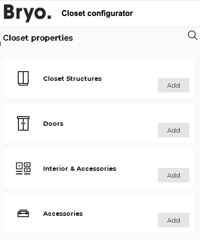
catalogData
The catalogData is used to configure the different catalog entries data displayed in the Storage configurator.
design
| Status | Type | Default value |
|---|---|---|
| Optional | array of catalog object | [] |
Each item in design is an object which describes the information of the catalog. It contains the following attributes:
icon
| Status | Type | Default value |
|---|---|---|
| Mandatory | string | "" |
The name of the SVG icon to use for this catalog. Supported values are listed below.
translationKey
| Status | Type | Default value |
|---|---|---|
| Mandatory | string | "" |
The translation key suffix for the catalog entry name. The configurator builds the full translation key like follows (where {key_suffix} is replaced by the provided translationKey)
full key = catalog_entry.design_state.{key_suffix}
closedTags
| Status | Type | Default value |
|---|---|---|
| Mandatory | array of number | [] |
List of closed tag IDs that are searched when the user clicks on catalog button. Search results are any product that has either of these closed tags.
freeTags
| Status | Type | Default value |
|---|---|---|
| Mandatory | array of string | [] |
List of free tag IDs that are searched when the user clicks on catalog button. Search results are any product that has either of these free tags.
productRank
| Status | Type | Default value |
|---|---|---|
| Optional | boolean | false |
Defines if the searchScore must be used when sorting results of the search.
About the Icons
Each catalog entry is illustrated by an icon that you can choos from the predefined list below:
| Picto name | Icon |
|---|---|
| accessories-closet |  |
| accessories |  |
| appliances |  |
| closet-structure |  |
| coverings |  |
| deco |  |
| dining |  |
| doors-closet |  |
| doors |  |
| flooring |  |
| front |  |
| furniture-alt |  |
| furniture |  |
| handles |  |
| objects |  |
| openings |  |
| worktop |  |
| nonVisibleItems |  |
Example
"catalogData": {
    "design": [
        {
            "icon": "closet-structure",
            "freeTags": [],
            "closedTags": [
                275,
                518
            ],
            "productRank": true,
            "translationKey": "box"
        },
        {
            "icon": "doors",
            "freeTags": [],
            "closedTags": [
                536
            ],
            "productRank": true,
            "translationKey": "door"
        },
        {
            "icon": "accessories",
            "freeTags": [],
            "closedTags": [
                539,
                192,
                546
            ],
            "productRank": true,
            "translationKey": "interior_accessories"
        },
        {
            "icon": "nonVisibleItems",
            "freeTags": ["nonVisibleItem"],
            "closedTags": [ ],
            "productRank": true,
            "translationKey": "accessories"
        }
    ]
}
The above example produces the following catalog entries:
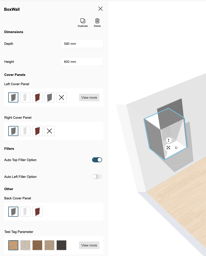
editPanel
The editPanel attribute groups settings related to product panel configuration.
groups
| Status | Type | Default value |
|---|---|---|
| Mandatory | array of parameters object | [] |
The groups is used to define the groups of the parameters displayed in the product panel. It contains the following attributes:
parameters
| Status | Type | Default value |
|---|---|---|
| Mandatory | array of string | [] |
The array contains the list of parameters which will be displayed as a group. The parameters of the product will be shown in the panel as the same order defined in the array.
translationKey
| Status | Type | Default value |
|---|---|---|
| Mandatory | string | "" |
The translation key is used to translate the name of the group displayed as the title in the panel.
The product panel will display all the visible and editable parameters of a product selected. If a parameter is visible and editable but NOT defined in any array of
parameters, it will be shown in the group "Other". It means that you need to have atranslationKeyasedit_panel.groups.otherfor displaying any visible and editable parameters which are not belongs to any groups.
Exemple
"editPanel": {
    "groups": [
        {
            "parameters": [
                "width",
                "depth",
                "height"
            ],
            "translationKey": "edit_panel.groups.dimensions"
        },
        {
            "parameters": [
                "leftCoverPanel",
                "rightCoverPanel",
                "topCoverPanel"
            ],
            "translationKey": "edit_panel.groups.cover_panels"
        },
        {
            "parameters": [
                "autoLeftFillerOption",
                "autoRightFillerOption",
                "autoTopFillerOption"
            ],
            "translationKey": "edit_panel.groups.fillers"
        }
    ]
}
The above example produces the following product panel:
search
The search attribute groups settings related to the search configuration.
aggregationParameters
| Status | Type | Default value |
|---|---|---|
| Optional | array of string | [] |
These aggregation parameters are used in the product browser, replace catalog and the search bar.
For a parameter to be used as a filter, it must be set as a searchable parameter on the product(s) and defined in the API and in application distribution parameters in 3dcloud.
➡️ See the Searchable Parameters 🔗 for a further explanation of how to set the parameters.
{
    "aggregationParameters": [
        "commercialDepth",
        "commercialWidth"
    ]
}
sortStringFilter
| Status | Type | Default value |
|---|---|---|
| Optional | string | "desc" |
sortStringFilter defines the sorting order of the string type filters in the Catalog Browser. If the value of the sortStringFilter is asc it will be sorted in alphabetical order. And If the value is desc, it will be sorted in reverse alphabetical order.
The default value for the key is desc. If no value is provided for the key, by default the filter will be sorted in the reverse alphabetical order.
{
   "sortStringFilter": "desc",
}
sortNumericFilter
| Status | Type | Default value |
|---|---|---|
| Optional | string | "desc" |
sortNumericFilter defines the sorting order of the number type filters in the Catalog Browser. If the value of the sortNumericFilter is asc it will be sorted in ascending order. And If the value is desc, it will be sorted in descending order.
The default value for the key is desc. If no value is provided for the key, by default the filter will be sorted in the descending order.
{
   "sortNumericFilter": "desc"
}
plans2d
The plans2d attribute groups settings related to the generation of 2d plans.
➡️ Refer to 2D Plan Information 🔗
version
| Status | Type | Default value |
|---|---|---|
| Mandatory | number | – |
The 2d plans configuration version. The current last version is 2.
showInfoGrid
| Status | Type | Default value |
|---|---|---|
| Optional | number | – |
To apply Information Grid on the 2DPlans generated.
configs
| Status | Type | Default value |
|---|---|---|
| Optional | array of config objects | [] |
The list of 2D plans configurations. Each config object will result in 1 generated plan. You can generate several 2D plans of the same view with different visible elements on each view.
Possible parameters for a configuration object are:
| Name | Mandatory | Type | Possible Values | Description |
|---|---|---|---|---|
typePlan | yes | string | "Top" "Face" "TopGround" "TopWall" | the type of plan to compute |
showFurniture | – | num | 0 or 1 | draws the furniture. (default value: 1) |
showFurnitureDimension | – | num | 0 or 1 | draws the furniture dimensions. (default value: 0) |
showDepthDimension | – | num | 0 or 1 | draws the furniture depth dimensions. (default value: 0) |
showWallDimension | – | num | 0 or 1 | draws the wall and bay dimensions. (default value: 0) |
showNumbering | – | num | 0 or 1 | draws the furniture numbers. (default value: 0) |
showFronts | – | num | 0 or 1 | draws the front and handles of the products (default value: 1) |
tagsToShow | – | Array<num> | [...] | a list of product tags to show in the 2D Plans |
tagsToHide | – | Array<num> | [...] | a list of product tags to hide in the 2D Plans |
tagsToMeasure | – | Array<num> | [...] | a list of product tags to measure in the 2D Plans |
roomsOnly | – | num | 0 or 1 | draws a plan for each room that contains products (default value: 1) |
resol | – | num | 1 - 1000 | Resolution in PPI. (default value: 300) |
scale | – | num | 0 or 1 | Scale of the plan when printed at the current resol (20 means 1/20 scale) (default value: 20) |
imageWidth | – | num | 0 or 1 | Width of the 2D plans in pixels |
imageHeight | – | num | 0 or 1 | Height of the 2D plans in pixels |
Example
"plans2d": {
    "version": 2,
    "showInfoGrid": 0,
    "configs": [
        {
            "resol": 300,
            "scale": 20,
            "typePlan": "Top",
            "roomsOnly": 1,
            "showFronts": 1,
            "imageWidth": 2244,
            "imageHeight": 1772,
            "showFurniture": 1,
            "showNumbering": 1,
            "showWallDimension": 1,
            "showFurnitureDimension": 1
        }
    ]
},
widgets
The widgets attribute is used to configure the use of default widgets in the configurator. It contains a key for each supported widget in the configurator.
productSheet
| Status | Type | Default value |
|---|---|---|
| Optional | object | false |
Defines the configuration of the Product Sheet 🔗 default widget that is used for displaying product information.
It supports the following keys/values:
dimensions
| Status | Type | Default value |
|---|---|---|
| Optional | boolean | true |
Defines if the dimensions of the product are displayed or not.
price
| Status | Type | Default value |
|---|---|---|
| Optional | boolean | true |
Defines if the price of the product is displayed or not.
Example where the dimensions and price are disabled:
"productSheet": {
    "price": true,
    "dimensions": false
}
autoFillers
The autoFillers attribute is used to configure the use of automatic fillers in the configurator. Below are the supported keys for this object.
baseFillerIds
| Status | Type | Default value |
|---|---|---|
| Optional | array of strings | [] |
Defines the base filler ID that is inserted by the configurator when adding an automatic base filler (i.e. filler touching the floor). The setting must be defined as an array of IDs, and the first available filler (at the time of configurator startup) from this list will be used by the configurator.
topFillerIds
| Status | Type | Default value |
|---|---|---|
| Optional | array of strings | [] |
Defines the top filler ID that is inserted by the configurator when adding an automatic top filler (i.e. filler not touching the floor). The setting must be defined as an array of IDs, and the first available filler (at the time of configurator startup) from this list will be used by the configurator.
minWidth
| Status | Type | Default value |
|---|---|---|
| Optional | number | 25 |
Defines the minimum dimension of the fillers. For base fillers, it is the horizontal width (from a box to the wall). For top fillers, it is the verical width (from the top of the box to the ceiling).
maxWidth
| Status | Type | Default value |
|---|---|---|
| Optional | number | 200 |
Defines the minimum dimension of the fillers. For base fillers, it is the horizontal width (from a box to the wall). For top fillers, it is the verical width (from the top of the box to the ceiling).