Parameters to Configure the Application Distribution
Each application distribution must define its own parameters, that is to say parameters are dedicated to a Distribution of the Home Application.
The parameters are written in a JSON object.
↗ Open a sample of a complete JSON object 🔗 with the whole parameters.
❗ The JSON object cannot contain any comment.
| For... | See... |
|---|---|
| Language, Units and Currency | locale, locales |
| Frame | sharingOptions |
| Materials | defaultWallMaterialID, defaultFloorMaterialID, exteriorFloorMaterials |
| Catalog | catalogEntries |
| Pricing | pricingOptions |
| Property Panel | propertiesPanelOption |
| Rendering | enableRender360 |
| Brands | displayProductBrand |
locale
Optional parameter – Value type: string
Name of the default locale for this Application Distribution. It must match the name of one of the defined available locales. Example: "en-US" The currency is inferred from the locales used in the application.
📌 If not set, the first locale specified in the list of available locales is used.
locales
This parameter contains the list of available locales for the Application Distribution. It must contain at least one element.
Mandatory parameter– Value type: list of local objects.
Object defining a set of regional parameters, can contain the keys / pairs below.
name
Mandatory key – Value type: string.
A combination of a mandatory and an optional element joined in a string and separated by a "-" (dash).
- MANDATORY: 2-letter code of a language, following 🔗 ISO 639-1.
- OPTIONAL: 2-letter code of a region / country, following 🔗 ISO 3166-1. Examples: "da-DK" for "Danish-Danemark" or "fr-FR" for "French-France".
fallback
Optional key – Value type: string
Used for translations only. If a translation key is not found for the given locale, the translation system falls back to this locale instead. If not specified, falls back to English.
unitSystem
Mandatory key – Value type: string.
Defines which unit system is used in the application. Valid values are:
- "metrics"
- "imperial"
lengthUnit
Mandatory parameter – Value type: string
Defines the base unit for length in the application. Valid values are:
- "millimeter"
- "centimeter"
- "decimeter"
- "meter"
- "inch"
- "foot"
- "yard"
lengthPrecision
Mandatory parameter – Value type: integer
The various lengths displayed in the application will be displayed with lengthPrecision decimal digits.
lengthFractionPrecision
Mandatory if "imperial" – Value type: integer
Used only when the value of unitSystem is "imperial".
lengthFractionPrecision is the minimal fraction of lengthUnit.
Valid values are: "8", "16" or "32".
Example 1 – Array of three locales with metrics
{
    "locales":
    [
        {
            "name": "fr-BE",
            "unitSystem": "metrics",
            "lengthUnit": "millimeter",
            "lengthPrecision": 0,
            "fallback": "en"
        },
        {
            "name": "nl-BE",
            "unitSystem": "metrics",
            "lengthUnit": "millimeter",
            "lengthPrecision": 0,
            "fallback": "en"
        },
        {
            "name": "de-DE",
            "unitSystem": "metrics",
            "lengthUnit": "millimeter",
            "lengthPrecision": 0,
            "fallback": "en"
        }
    ]
}
Example 2 – Array of two locales with imperial
{
    "locales":
    [
        {
            "name": "en-US",
            "unitSystem": "imperial",
            "lengthUnit": "foot",
            "lengthPrecision": 0,
            "lengthFractionPrecision": 16,
            "fallback": "en"
        },
        {
            "name": "es-US",
            "unitSystem": "imperial",
            "lengthUnit": "foot",
            "lengthPrecision": 0,
            "lengthFractionPrecision": 16,
            "fallback": "en"
        }
    ]
}
sharingOptions
The sharingOptions array can contain the keys / pairs below.
name
Optional key – Value type: string Indicates where the share is enabled such as on a social media, a mail or embeded via an URL.
enabled
Optional key – Value type: boolean Indicates whether the application allows the user to share a product / his project on the targeted social media or via mail or via an embeded URL.
❗ Note: The application only supports the following social medias facebook, twitter, pinterest as well by mail and via an embeded URL in the possible sharing options.
Example
 "sharingOptions": [
        {
            "name": "facebook",
            "enabled": true
        },
        {
            "name": "twitter",
            "enabled": true
        },
        {
            "name": "pinterest",
            "enabled": true
        },
        {
            "name": "mail",
            "enabled": true
        },
        {
            "name": "embed",
            "enabled": true
        }
    ]
propertiesPanelOption
This object defines how to display the properties of a product depending on the context (the first definition level of the object) and the type.
The data structure of the propertiesPanelOption object is the following.
propertiesPanelOptions
|____ DefaultState (array)
|           |__ types (array of strings)
|           |__ presentation
|           |     |__ parameter 1
|           |     |      |__ parameter
|           |     |__ parameter 2
|           |     |      |__ parameter 1
|           |     |      |__ parameter2
|           |     |__ parameter 3
|           |     |      |__ parameter 1
|           |     |      |__ parameter 2
|           |     |      |__ parameter 3
|           |     |__ parameter 4
|           |     |__ parameter 5
The object can contain the keys / pairs below.
defaultState
Optional key – Value type: array
Use types to define the way the properties will be displayed in the home application, in the main state.
types
Mandatory key – Value type: array of integers
An array of closed tag IDs. If empty, it means that this presentation is for all type of products (closed tag type) that do not have a more specific presentation defined. If not empty, this presentation will represent all products matching one of the closed tags in the list.
presentation
Mandatory key – Value type: object
Define the list of parameters in the right order.
Each presentation contains the following kind of properties:
- groups – array – Optional. In this array you will define grouping of parameters.
- parameters – array – Mandatory. This array is made of objects that define a parameter and its possible sub-options. The property panel in the planner will use the order that you define in this array. If a parameter in a product is visible but does not appear in parameters or groups array, it will be display after all parameters define by those list.
General Example
    "types": [],
    "presentation": {
        "depth": [],
        "width": [],
        "height": []
    }
In this example, you have a defined presentation that works for any type of product. In this presentation, there are three main parameters that we want to show first.
- The first one is the parameter depth.
- The second one is the parameter width.
- The third one is the parameter height.
pricingOptions
The pricingOptions object can contain the keys / pairs below.
priceTopAssembly
Optional key – Value type: boolean
The default value is "false".
Indicates whether the assembly product prices should include the price of the top assembly or not.
This only affects assembly products (i.e. BMA products), single component products (i.e. BM3 products) are always priced with their own price.
Example
"pricingOptions":
   {
      "priceTopAssembly": true,
   },
catalogEntries
This object is used to configure the different catalog entries that are displayed in the planner. The illustrations below show the hierarchy of the catalog entries (in the Home Planner).
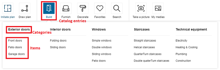
Then, the structure of data is the following:
- The first level of definition is the catalog entry. Only this level has an icon.
- The second level is the category. It is displayed as menu header in the planner.
- The third level is the sub-level of the menu, i.e. the menu item.
catalogEntry (first level, with picto) e.g. "Building"
    |
    |__ category (second level) e.g.`exterior doors`
    |   |
    |   |__ item (third level) e.g. `frontDoors`
    |   |
    |   |__ item (third level) e.g. `patioDoors`
    |   |
    |   |__ item (third level) e.g. `garageDoors`
    |   |
    |__ category (second level) e.g. `interior doors`
    |   |
    |   |__ item (third level) e.g. `foldingWindow`
    |   |
    |   |__ item (third level) e.g. `slidingDoors`
    |   |
    |__ category (second level) e.g. `windows`
    |   |
    |   |__ item (third level) e.g. `simpleWindows`
    |   |
    |   |__ item (third level) e.g. `doubleWindows`
    |   |
    |   |__ item (third level) e.g. `slidingWindows`
About the Icons
Each category entry is illustrated by an icon; some icons are fixed and others are customizable.
"Customizable" icons means that you can choose to have them or not.
"Customizable" does not mean that you can add your own icons. The ID of the icons point to an internal file.
📌 The code does not limit the number of icons, but there is a design limit: There is a risk that the pricing area blocks the expansion to the right of the icon area.
The catalogEntries object can contain the keys / pairs below.
Definition of the Catalog Entries
This level is the only one that has pictos.
picto
Mandatory key – Value type: string
The name of the SVG picto that will be used to represent this catalog entry.
translationKey
Mandatory key – Value type: string
The keys in the translation file corresponding to the translation of the catalog entry. The path to these translation keys is built by the code.
For example
"building": [
    {
        "picto": "windows",
        "categories": [
            {...}
        ],
        "translationKey": "windows"
    }
]
In this example, the complete translation key that must be in the translation find is:
navigation_catalog.building.windows
How deep is the key does not impact the final key. A same key can be used an many different levels.
categories
Mandatory key – Value type: array
Define in this array all the categories depending on the catalog entry.
Definition of the Categories
This level depends on the previous one and will be displayed as a menu in the planner. It is the first level of navigation.
translationKey
Mandatory key – Value type: string
Translation key. See above.
categories
Mandatory key – Value type: array
Define in this array all the subcategories below these categories.
Definition of the Items
The last level is the second level of navigation, i.e. the items in the menu.
translationKey
Mandatory key – Value type: string
Translation key. See above.
closedTags
Mandatory key – Value type: array
List of closed tag IDs that will be searched if the user clicks on that category.
The search made depending of the closedTags is a search of type OR.
For example: In this case, the search will browse all the products having the closedTags 253 OR 254.
{ "translationKey": "sliding_windows", "closedTags": [253, 254], "freeTags": []}
In this other example, clicking "Double windows" will start a search on all the products having the closedTag 252; clicking "Simple Window" will start a search on products having the closedTag 251, etc. But clicking on "Windows" will start a search on all the sub-categories, including tags 251, 252, 253 and 254.
 {
   "translationKey": "window",
   "categories": [
         { "translationKey": "double_windows", "closedTags": [252], "freeTags": [] },
         { "translationKey": "simple_windows", "closedTags": [251], "freeTags": [] },
         { "translationKey": "sliding_windows", "closedTags": [253, 254], "freeTags": [] }
   ]
}
freeTags
Mandatory key – Value type: array
List of free tag IDs that will be searched if the user clicks on that category.
The search made depending of the freeTags is a search of type OR. The operation is the same as for the closedTags, except that freeTags are strings while closedTags are integers.
Complete Example
The translationKey windows in the example below has multiple categories in the second level as a result, as illustrated:
catalogEntries impacts the catalog browser: the browser uses them to browse the catalog. The translationKey windows has two categories simple_windows, double_windows and sliding_windows that are displayed in the planner, as illustrated:

"building": [
   {
        "picto": "windows",
        "categories": [
            {
                "freeTags": [],
                "closedTags": [
                    251
                ],
                "translationKey": "simple_windows"
            },
            {
                "freeTags": [],
                "closedTags": [
                    252
                ],
                "translationKey": "double_windows"
            },
            {
                "freeTags": [],
                "closedTags": [
                    253,
                    254
                ],
                "translationKey": "sliding_windows"
            },
        ],
        "translationKey": "windows"
    }
],
defaultWallMaterialID
Mandatory key – Value type: string
Define the wall material that will be used by default when adding a wall or a room. For example:
"defaultWallMaterialID": "4755",
defaultFloorMaterialID
Mandatory key – Value type: string
Defines the floor material that will be used by default when adding a new room. For example:
"defaultFloorMaterialID": "4296"
exteriorFloorMaterials
Mandatory key – Value type: object
This object defines the floor materials that will be proposed to the users when adding an exterior for a garden, a terrace or a driveway.
garden / terrace / driveway
Mandatory keys – Value type: string
Each key will define the floor material for the matching exterior.
For example:
"exteriorFloorMaterials":{
      "garden":"74526",
      "terrace":"GENERIC_MATERIAL_01324",
      "driveway":"GENERIC_MATERIAL_00463"
   },
enableRender360
Optional key – Value type: boolean
Defines the 360 rendering availability in the application to take 360 images of the project. By default, the value is set to "true" so that 360 rendering will be enabled by default. Set to "false" if the user does not want 360 rendering.
Example Example with 360 rendering enabled and the default value:
"enableRender360": true
Example where the 360 rendering is disabled:
"enableRender360": false
displayProductBrand
Optional key – Value type: boolean
Defines whether the product's brand should be displayed in the UI or not. By default the value is set to "false".
By default, we consider that an application distribution owns only one single brand so we hide it. Though, the brand information can be useful along with other product's information as long as the application distribution owns multiple brands.
When the parameter is set to true, the brand will be displayed on products browser cards, Product Sheet 🔗 as well as all UI modules that displayed a products list (Project Overview 🔗 price detail and Print 🔗 items list).
Examples:
For a single brand (default value):
"displayProductBrand": false
For multiple brands:
"displayProductBrand": true